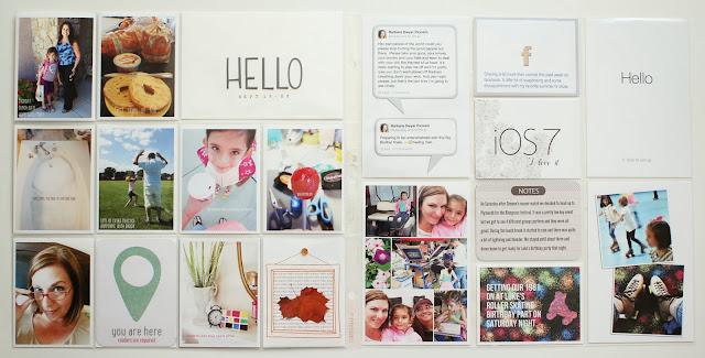
I know this is a bit out of order and I'm sorry about that but I wanted to share a few sneaks that I've put up online of my week 37 spread. This spread will be submitted for the Studio Calico Cutting Edge class which starts tomorrow so the only place you will be able to see it is in the classroom.
Today is the last day to sign up so if you haven't already I encourage you to do so. The cut files are so awesome and I know the class will be jam packed with lots of new ideas and lots of info on the fun new materials you can cut.
Click here to sign up before its too late!
See you in class!
Monday, September 30, 2013
Wednesday, September 25, 2013
Project Life 2013 - week 38
Wow, it feels like its been forever since I posted, sorry about that. I meant to post last week some sneaks of my week 37 spread (it's being submitted for the Cutting Edge class), but I'm still not quite done. I will post some when its done probably at the very end of this week or early next week.
On to this weeks spread and its Autumn, yay! I managed to get a few fall-ish parts in which makes me happy. I seriously can't believe were here again so quickly.
I had to squeeze all the pictures from the majority of the week on the left side as usual so it's an eclectic mix for sure. A lunch date for Simone with her Aunt after school on Monday, my favorite fall food items are popping up at the store, a much needed bath for me one morning, extra soccer practices with Daddy, our morning walks to school, a sweet treat for me, a clear sign I'm not getting any younger, a super cool art project that Simone received from Kiwi Crate and the first official day of Autumn. The You are Here geo tag card is from the September Studio Calico Double Scoop Project Life Kit. The Hello alpha on the title card is from the Main scrapbook kit and it's from the Amy Tangerine Cut and Paste line, I need these in every color, love them!
For the right side I picked a few posts I made on social media that I wanted to remember and documented the upgrade for my phone and ipad (love it). The bottom is all Saturday, we hit a music festival in the late morning and Simone had a super fun birthday party that night, and yes if you noticed I've fixed the typo on the skating card. I always notice after I've photographed everything, darn it. The two middle horizontal cards are from the Mint Chip and Double Scoop Project Life kit (linked above).
I decided to leave the soccer game pictures to an insert, it just makes sense since I usually have lots to include. Only one photo on the insert is mine (the small photo of the Dad's with wagons), the rest taken by the same team Dad I mentioned previously, he's amazing and mine pale in comparison which makes for easy decision on what to include. I am loving my little recap cards and just took notes on my phone by quarter and it made filling it out super easy today.
I hope you have a great rest of the week, mine is super busy which is both good and bad, I'm sure you can relate.
Monday, September 16, 2013
For all the soccer moms....
So I was thinking about ways to document the soccer season in my Project Life spreads and I decided a little 3x4 match recap card could be kind of cute. I wanted it to be like a little form that I could fill out that gave all the pertinent details that I might want to document. Things like who we played, how much of the game Simone played, what positions she played, did she score any goals, etc. This is what I came up with and posted on Instagram on Saturday.
I just changed the boxes to circles and added some circles to check the home and away options.
I was quite surprised how many people liked it and wanted it, in fact wanted to buy it! It took me about 15 minutes of playing around online on Sunday to realize setting up a place to sell things is not what I'm looking to do right now so I decided to share it.
I did make a few subtle modifications to it and below is what I'm sharing.
I'm providing two different downloads; a PDF sheet of 6 and a single .png file if you want to recolor in Photoshop or Photoshop Elements.
Full Sheet PDF download here
.png file download here
If you want to share this with other soccer loving friends that's great, I just ask that you redirect folks here for the downloads or hover over the image above and you'll see a Pinterest button to share it that way. All I ask is that you please not post it anywhere else as a download or email the files around.
Thanks and I hope you enjoy it!
Wednesday, September 11, 2013
Project Life 2013 - week 36
This past weekend was my daughters first official soccer match so I dedicated the whole right side to the day. Luckily for us one of the Dad's is an amazing photographer and shared some really awesome photos with us. The photo I enlarged for the right hand side top section and the photo directly below it are his. The other two are mine and barely come close to his. You should see the amazing camera he has.
Because the right side is so bold and so purple I opted to keep the left side a bit softer. I did carry the purple over to the title card to help balance it out and added the silver star for consistency. The top right dance in the rain card and the book outline card at the bottom are from this set by Valorie Wibbens and can be found at The Lilypad, It rained on Labor Day so we ran outside in our jammies for a bit, it was fun. Its funny because it rained on Memorial Day as well. I guess mother nature wants us to do something other than hang out outside on these holidays. I guess she feels we have enough sunshine the other days of the year. One day after school we had a lunch out and saw a movie, I got some super cute new shoes. Simone had a friend over for a lunch date after school. The super cute composition book card is by Emily Merrit and can also be found at The Lilypad here. I opted instead of making it flip up I made it flip open like a book (the inside is below). Simone has been putting herself to bed lately so a bit about that. It was super hot this past weekend so summer isn't going anywhere anytime soon, and of course football is back!
So apparently there is homework in Kindergarten now, man alive! I used a few cute elements from this set by Shanna Noel at Studio Calico to help tell the story.
Here is the right side and that amazing photo. The digital element on top of the photo is also from Shanna's set that I linked to above. I had originally printed it with a white border but because the 4x6 slots are a bit looser than the other two the white border wasn't lining up right and it bugged me so I removed it. The two photos that I took help back up the journaling I did which I kept super simple.
It's funny because when we first moved here I was super against soccer, I did not want to be that mom, on the sidelines every Saturday. Boy was I wrong, its so much fun and the girls have an amazing time. It sure helps that we have a super amazing coach and super fun families to spend our time with.
Until next time,
Monday, September 9, 2013
My space, it's always evolving...
If you have a dedicated craft space I'm sure you can relate to getting tired and overwhelmed and feeling like you can't find what you want when you need it. That was me the past week or so and I've been fiddling around with where I would put what and how to improve my organization. I think it started with a complete overhaul of how I stored my stamps and then it went all crazy.
Here is where I stand as of right now
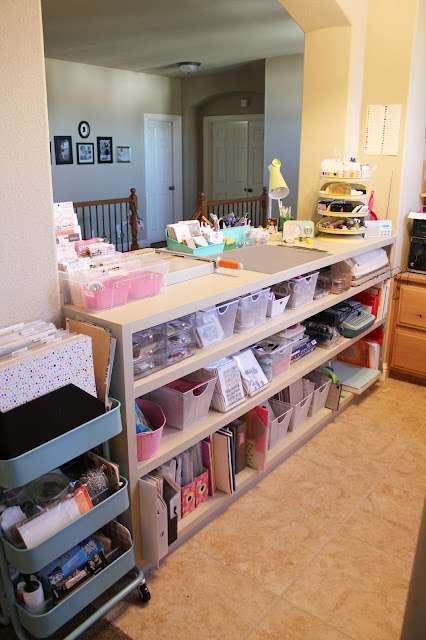
A little over a year ago my husband built this counter and shelf unit for me (you can see my posts on it here, here and here) and its been great. It holds everything I need it to hold and it completely transformed the space and made it much more usable than it was originally.
The first thing you see when you enter is my Raskog cart. I use the top tier to hold 4 paper organizers. The front one is pattern paper, the second is colored cardstock, the third is a continuation of colored cardstock and woodgrain paper and the fourth is all specialty paper like vellum, transparencies, glitter cardstock stuff like that. The two lower bins are all things I don't need that often so they're stored here, larger size punches, blank tags, etc.
Underneath the counter I have most of my supplies. I'll walk you through what's in each below. All of the white wire bins were purchased at Target in the dollar section. Whenever I see them come back I buy a few more, they fit perfectly on these shelves and I can pull them out as needed.
Here you can see how the Cameo pulls out for cutting. There is enough room in back for the mat to feed all the way thru the machine. I just pull it out when I need it and push it back in out of the way when I don't.
I'm a see it or I won't use it type of person so on top of my counter I have these two Ikea Samla bins for embellishments. I was using the Antonius inserts but find that these offer more flexibility because the sides are completely open so for odd size packs of embellishments I don't have to worry about the size of the bins, they all fit in. I put a few smaller plastic bins inside to hold loose items like alphas and misc. cuts that have come with the kits and such.
My Tonic trimmer sits right next to that.
In the middle of the counter I have a Fiskars cutting mat that I use as a work surface, mainly so the painted counter doesn't get too messed up. Behind it I have a two containers from Land of Nod, the left has my current Project Life kit cards and some special ones I haven't used yet, some letterpress cards I made, some special packs of cards I've purchased, the 4x6 kit cards and the mini alphas that come in the kits. Next to it on the right is the other Land of Nod container that I use for all of my tools and pens. In front I have a container that holds my Peerless watercolor papers and a little organizer that holds special paper clips, some flair and other specialty bits from the kits. The little round tub holds small embellishments from the last few kits that I haven't put away yet or that I still want to use.
To the right of my mat I have a light, my husband pulled the electrical outlet that he covered when he installed the counter up to the top so I could still use it, my radio also plugs in here. My Harbor Freight rack (that I spoke about in detail here) holds all kinds of stuff as you can see. Mists, acrylic blocks, my most used stamp pads, all of my roller stamps, my adhesives and small tools.
When I initially moved all my stamps to the Avery Elle pockets last week I had them in one of the Samla boxes I have on top of my desk. It worked really well and I did like it but my stamps were a bit tight and I couldn't flip thru them as well as I liked. While I was shopping at Home Goods I found these bins for organizing your pantry and they are a better fit. The best thing is they fit on my shelf.
I ran the cardstock inserts thru my printer and added the stamp manufacturer/designer on each in the upper left corner and that's probably all of the labeling I'll do. I like to be able to move things around so labeling the card stock and not the outside of the sleeve means I can move things around as needed. In this bin that is all Studio Calico I have them sorted but not too rigidly; in the front are all alpha sets, then the larger 4x6 sheets, the slim 1x6 sets, then the smaller 2x2 or odd size sets (I combined as many as I could fit in one sleeve as you can see above) and last are the red foam mounted background stamps. I did not adhere the sets to the cardstock and even with standing upright, they don't move around inside which is a plus for maximizing space.
The other bin is sorted alphabetically by manufacturer/designer name.
I purchased 75 sleeves and inserts and used 70 of them between the two bins. There are tons of stamps in these 70 sleeves so they are awesome for holding lots of stamps.
This is the view as you walk in, there is a counter with my computer, printer, nasty cords that need dealing with, some shelves with bits on them and a larger work surface that I lay stuff out on. The natural light from the two windows is awesome except in the afternoon, (it faces east) so my mom made the sheer curtains for me to help block out the glare without loosing the light. My husband also recently changed out the overhead light for me. It was a flush mounted fixture but because the ceiling is so high in the space it didn't give much light at night. I purchased a 5 light chandelier that directs the light downward an its made a huge difference at night.
So that's pretty much it, if you have more questions let me know.
Edited: I have revised my craft space tour, if you are interested you can see the updated tour right here.
Here is where I stand as of right now
A little over a year ago my husband built this counter and shelf unit for me (you can see my posts on it here, here and here) and its been great. It holds everything I need it to hold and it completely transformed the space and made it much more usable than it was originally.
The first thing you see when you enter is my Raskog cart. I use the top tier to hold 4 paper organizers. The front one is pattern paper, the second is colored cardstock, the third is a continuation of colored cardstock and woodgrain paper and the fourth is all specialty paper like vellum, transparencies, glitter cardstock stuff like that. The two lower bins are all things I don't need that often so they're stored here, larger size punches, blank tags, etc.
Underneath the counter I have most of my supplies. I'll walk you through what's in each below. All of the white wire bins were purchased at Target in the dollar section. Whenever I see them come back I buy a few more, they fit perfectly on these shelves and I can pull them out as needed.
- These clear acrylic drawers hold odds and ends like seasonal sequins, seasonal stuff, misc. die cuts, tabs, sequin bits I want to hide from my daughter, ha!
- This bin holds all of my 6x6 paper pads and some extra stock of journaling cards that I have purchased
- Large veneer pieces and back stock of veneer sets that I love
- Leftover Project Life kit cards from previous months, I still go back to past months all the time so I keep them handy
- My washi collection
- My larger stamp press, stamp cleaning pad and baby wipes for clean up
- Embroidery floss and twine and this is where I keep the Amy Tangerine stitching templates.
- Rubber stamps, this bin is all Studio Calico (I'll talk more below)
- Rubber stamps, all other manufactures and designers
- Misc. wood handled rubber stamps, small wood alpha stamps, a few Prima sets and some stamps from Typo
- A bin of pigment ink pads and embossing powders and a roll of waxed paper
- These paper bins hold lots of things like 12x12 alpha sheets, large size sticker sheets, all of my masks, specialty materials for the Silhouette and odd size page protectors
- My supply of various watercolor papers
- A small stash of specialty mini albums and my still incomplete This is Me album along with supplies for it and the bag is a bunch of memorabilia I want to include in it
- Thickers and letter stickers these are colors. They are sorted by color and I made tall dividers from chipboard
- Thickers and letter stickers these are black, white, brown/kraft, gold and silver
- my Letterpress supplies; inks, plates, paper, etc.
18. Sequins, veneer and other small embellishments
19. My Silhouette Cameo
20. A bin that holds my heat embossing tool, a small trimmer, a small cutting mat, a glass cutting
mat and my ancient Creative Memories circle cutter
21. My typewriter (its usually covered so it doesn't get dusty)
22. 4x6 Photo paper, some older magazines I've kept and a binder of class handouts from
previous classes I've taken.
23. My letterpress plate and Cuttlebug
24. My Cameo mats (old and new) and my supply of 12x12 Project Life protectors in the boxes
25. Regular paper for my printer and 8 1/2 x 11 sheets of photo paper and matte photo paper.
Here you can see how the Cameo pulls out for cutting. There is enough room in back for the mat to feed all the way thru the machine. I just pull it out when I need it and push it back in out of the way when I don't.
I'm a see it or I won't use it type of person so on top of my counter I have these two Ikea Samla bins for embellishments. I was using the Antonius inserts but find that these offer more flexibility because the sides are completely open so for odd size packs of embellishments I don't have to worry about the size of the bins, they all fit in. I put a few smaller plastic bins inside to hold loose items like alphas and misc. cuts that have come with the kits and such.
My Tonic trimmer sits right next to that.
In the middle of the counter I have a Fiskars cutting mat that I use as a work surface, mainly so the painted counter doesn't get too messed up. Behind it I have a two containers from Land of Nod, the left has my current Project Life kit cards and some special ones I haven't used yet, some letterpress cards I made, some special packs of cards I've purchased, the 4x6 kit cards and the mini alphas that come in the kits. Next to it on the right is the other Land of Nod container that I use for all of my tools and pens. In front I have a container that holds my Peerless watercolor papers and a little organizer that holds special paper clips, some flair and other specialty bits from the kits. The little round tub holds small embellishments from the last few kits that I haven't put away yet or that I still want to use.
To the right of my mat I have a light, my husband pulled the electrical outlet that he covered when he installed the counter up to the top so I could still use it, my radio also plugs in here. My Harbor Freight rack (that I spoke about in detail here) holds all kinds of stuff as you can see. Mists, acrylic blocks, my most used stamp pads, all of my roller stamps, my adhesives and small tools.
When I initially moved all my stamps to the Avery Elle pockets last week I had them in one of the Samla boxes I have on top of my desk. It worked really well and I did like it but my stamps were a bit tight and I couldn't flip thru them as well as I liked. While I was shopping at Home Goods I found these bins for organizing your pantry and they are a better fit. The best thing is they fit on my shelf.
I ran the cardstock inserts thru my printer and added the stamp manufacturer/designer on each in the upper left corner and that's probably all of the labeling I'll do. I like to be able to move things around so labeling the card stock and not the outside of the sleeve means I can move things around as needed. In this bin that is all Studio Calico I have them sorted but not too rigidly; in the front are all alpha sets, then the larger 4x6 sheets, the slim 1x6 sets, then the smaller 2x2 or odd size sets (I combined as many as I could fit in one sleeve as you can see above) and last are the red foam mounted background stamps. I did not adhere the sets to the cardstock and even with standing upright, they don't move around inside which is a plus for maximizing space.
The other bin is sorted alphabetically by manufacturer/designer name.
I purchased 75 sleeves and inserts and used 70 of them between the two bins. There are tons of stamps in these 70 sleeves so they are awesome for holding lots of stamps.
This is the view as you walk in, there is a counter with my computer, printer, nasty cords that need dealing with, some shelves with bits on them and a larger work surface that I lay stuff out on. The natural light from the two windows is awesome except in the afternoon, (it faces east) so my mom made the sheer curtains for me to help block out the glare without loosing the light. My husband also recently changed out the overhead light for me. It was a flush mounted fixture but because the ceiling is so high in the space it didn't give much light at night. I purchased a 5 light chandelier that directs the light downward an its made a huge difference at night.
So that's pretty much it, if you have more questions let me know.
Edited: I have revised my craft space tour, if you are interested you can see the updated tour right here.

Wednesday, September 4, 2013
Project Life 2013 - week 35
I kept my spread super simple this week as you will see, especially my title card.
This week seemed more coffee focused than normal so I had to include some of the shots I took. Because we were out of beans Larry and I went out for coffee on Friday after we took Simone to school. It was nice to sit and enjoy it and pick up a fresh supply for home. While I was there I grabbed the super cute envelope for a gift card to use somehow in the spread. Saturday afternoon I had my first Pumpkin Spice Frap, so yummy and paired with the September Issue outside on a 90° day was perfection. The magazine was 665 pages this year and what stood out to me as must haves are listed on the card next too it. Needless to say, it's all right up my alley, especially the leopard print.
Before my coffee and the magazine time Simone asked to go to the mall, since I knew this event was happening it was easy to say yes. I'm so glad we went, it was so great to see some of my old work peeps and the event was amazingly executed. So much fun!
Here is a look inside the coffee envelope and the inside of the flip up card.
On Monday last week our family left and I snapped the photo of Larry taking them to the airport and the sweet note my niece left on Simone's bed. When reviewing my photos in my photo stream I found the image of George. I guess Simone snapped a screen shot while watching him on my ipad. It was a perfect way to include a bit of what she is loving right now. I made the image black and white like I've done before and just kept him in color, it helped tie it in to the spread a bit more. Next to it is a screen grab I took of some IG likes that made me giggle and some new casual bling for me. The letterpress card next to it is from LifeLovePaper at Studio Calico. I had a doctor appointment and snapped this shot to send to a friend I was texting while I was waiting for the doctor. Simone's cannonball, and a bit about the recent class announcement. The Yes card was one of the first I made with my new letterpress stuff. It was so much fun and there is still time to sigh up for the class if you are interested. The title card as always came last and honestly I was a complete blank on what to do. I knew it needed to be simple and I knew I wanted to pull the color from the left side over so this is what I came up with. Super simple, made in Photoshop Elements in minutes. I love it and I want to do it again.
I did include a little insert this week as well, a super lovely invite I got for the MAC event. I received two different versions but I used this one because of the super pretty gold side. I cut a piece of clear plastic and just stapled the card to it in three places. This gave me something to punch holes in so it would fit in the album rings.
I hope you have a great week, I cannot believe its September....
Monday, September 2, 2013
Get ready for Cutting Edge
First off let me say Happy Labor Day to those of you in the US, I hope you have a much deserved relaxing day.
Yesterday Studio Calico announced their October class, Cutting Edge. I'm super excited to be part of another class with them and can't wait to get my hands on the cut files and the super duper cute happy face stamps. Susan is one of my very favorite scrapbookers and photographer and I'm so happy she asked me to contribute to her class.
The list of contributors is awesome, so many people I love on this list.
Here is some info on the class kit everyone will receive.
Here is an early sneak from Susan of some of the cut files.
I'll of course share some sneaks of what I'm doing as we get closer to class but I do hope you'll join us.
Have a great day today and see you back on Wednesday.
Subscribe to:
Posts (Atom)