My families love of
Evergreen Lodge has been well documented over the years here on this blog. We go there year round and its just as good in the winter as it is in the summer but summer has a special place in my heart because we get to hang out at the pool. If you ever have a chance to visit Yosemite National Park and need a place to stay, we highly recommend it.
My husband and I went this past March just the two of us and I made a mini album of that trip for a special class over at Elle's Studio. I spoke about that project in this post
here. That album ended up being a favorite of mine so I knew it would be fun to do another one that I could share completely here on the blog. About a week before we left I got an email from Field Notes Brand sharing the new
Campfire notebook set. The notebooks are 3.5" x 5.5" tall and have 48 grid pages in each notebook. I immediately thought of this trip and decided to order them to use as my album base. It ended up being the perfect size to document a quick trip. I decided to use the middle album called Night. Each album has a different color inside and the grid matches that color. The color inside Night is orange and since I'm on an orange kick lately it ended up being the perfect match.
My supplies for this project were pretty minimal. I built a lot of the pages around a set of digital printable cards from an older Studio Calico collection called
Adventure. And I also added in some cards from In A Creative Bubble, gold dot washi tape, assorted puffy stickers, some rubber elements, some gold glittery stars, a few clips and that's about it. I'll link up to anything that I can as I go page by page.
Here is a look at the inside of the notebook. I love the attention to detail Field Notes Brand has. Their humor is pretty spot on too. For the first page I printed one of the cards from the Studio Calico set onto vellum and traced over one of the inset lines with a Heidi Swapp Minc pen and ran it thru the Minc machine to add in a little bit of gold foiling.
Here's a better look at the gold foiling.
For the first spread I used a journaling card from the
Spring Break set from In A Creative Bubble. I used another card from this set later in the album too. I added in the washi tape, an old rubber element that I think was from Studio Calico and a large photo.
As you will see I printed a lot of my photos large size, some span two pages and then I printed some small, just to vary up the sizes so it doesn't get boring. I set up a template in Photoshop Elements with the exact size measurement making it just a bit smaller so it didn't go all the way to the edge. This helps in two ways, 1) it kept me from agonizing if my edges were straight and perfect and 2) it allowed the pages to turn easier since they didn't fit tight into the binding of the notebook. I used a really old Teresa Collins Zutter Round It All to trim my corners. I love that cutter. I'm not sure if its still available but that thing cuts corners like a dream and I use it a lot. Plus it was a pretty good match to the rounded corners of the notebook.
Our love of road trip snacks had to be documented. This card is from an older free set from Digital Design Essentials and I don't think its available anymore but she is selling cards in an
Etsy Store and her designs are some of my favorite. I added in some text before I printed it and then a puffy sticker from an old Amy Tangerine set. The gold clip is old from Studio Calico.
Here is another card from the In A Creative Bubble set that I linked to above. The puffy sticker is old from Studio Calico. I used two large wood veneer stickers in this album. They came from the gift shop at the Evergreen Lodge and they were made for them by a company called
Dust City Wood Stickers. These things are so cool. They have super strong adhesive and you can even stick them to the outside of water bottles. These were custom made for the Lodge so you can only get them there but they have some other really awesome designs on their website.
I didn't want to dedicate a whole page to the sticker so I opted to make a little page of vellum that I cut to match the size of the photo underneath. I made sure to leave a little edge that I could fold behind my photo and then stick down. This way it flips open to expose the photo underneath as you can see in the next image.
Here is my first photo that spans two pages, I did this for a few images that I really wanted to call importance too. I added in some digital text before printing using a
brush script digital alpha from Studio Calico. I added in a few gold glitter stars and it was done.
Another old journaling card that I modified a bit leaving room for a washi strip and a black puffy star and I used another one of the gold clips used like a flag to fill in some space.
I decided not to add text to every photo in the album so in a few cases I would type up my journaling on one card that referenced the photos that would come behind it and left it at that. It ended up being a perfect way to let the photos tell the story and keep it more simple.
Here is the other wood veneer sticker with the same folded vellum treatment. I really love this one because the nightly s'mores is such fun part of staying at this place.
Probably my favorite photo in the whole album. I added in a simple phrase sticker that is from an old A Beautiful Mess box and a gold star.
This is a journal card from the Studio Calico Adventure set that I linked above. More washi and a simple die cut. I wasn't sure how to work these four photos into this page so I printed one large, made a photo strip of the other three sized to fit inside the book and just clipped it in with a paper clip. I like the varying sizes here.
Simple spread with a tiny bit of journaling. I cut up the park map to add in a small section to the album.
I made this journaling card using a digital element from Paislee Press from the new
Scenic Route collection and another old A Beautiful Mess word strip.
Here I added in a bit of text on the photo before printing and used more washi and an old Studio Calico die cut.
This is a really old Studio Calico journaling card cut in half and an old die cut. The word art I added to the photo is from the Studio Calico
Fun in the Sun set.
Not all photos turn out the way you want them too so sometimes you have to just roll with it or find another way to tell the story. In this case my photos of the bear we saw were just a brown blob in a field of green so I decided to use a digital element to tell the story. This
bear is from Studio Calico and I love him. And that poor dear looks hangry!
A really old Studio Calico card and some washi.
Another old rubber element from Studio Calico, I really love rubber banners.
A collage of pictures that I made, more washi and another old Studio Calico die cut.
Our cabin had the best sunset views and this photo has no filters on it at all. Its exactly what I saw with my eyes and I love it. It lost a bit of detail of the trees when I had to crop it to fit but it will get printed and framed for sure. The silhouette of the charred burned trees is just so cool. Just a little back story but the lodge was almost destroyed by a major forest fire a few years ago and the fire reached all the way to the very edge but was stopped, thankfully.
Another journaling card from the Adventure set, a gold glitter star and another old Studio Calico die cut. I trimmed this card slimmer that 3" wide just to mix it up.
This mountain card from the Adventure set is so cool. I added in some gold triangles from an old Heidi Swapp Project Life kit to play up the triangle trees.
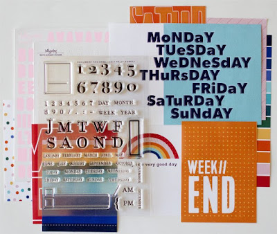
I always sign and date my mini albums on the day I finish them and I used the new
Art Stamp set from Life Love Paper for Studio Calico. I bought this stamp set just to use for signing and dating my projects.
And that it it! This little little album is chunky! Here is a look at how full it is.
I ended up filling all but 2 of the 48 pages of the notebook and it was a bit of a happy accident. I did pre plan the album a bit, mainly just listing out what photos I wanted to go it what order, leaving room for journaling or elements that I knew I wanted to include. It wasn't super strict or rigid but it helps give me a guide lines as I'm working. My process is to print as I go, nothing get's printed in advance. It just how my brain works. I like to decided as I go what size things will be. Here is a look at what that planning looked like.
To store the album, since it won't stay closed on its own I'm using a thick rubber band that I found in my stash. Its not super tight so it won't break the spine of the album but its tight enough to keep it closed. I can't wait to add this to my mini album collection.
Thanks for sticking around for this super photo heavy post.
See you soon.


