Monday, August 31, 2015

Inspired by │ where we ate

I think because I'm a crafter and scrapbooker I see things when I'm out and about that totally inspired what I make. A week or so ago my husband and I went out to eat lunch at a restaurant that I had been to before be he had not. It's called Hook & Ladder Manufacturing Company and its in Sacramento. I love this place, the whole aesthetic is just super cool. I love the way its decorated, I love the marquee lights they used for their sign, I love the menus, and I love the pallet wall as you enter the restaurant. I knew I wanted to make a layout for the visit and Kelly Purkey's Food Coma stamp set was definitely the perfect choice to accent it.

Here's the layout that I made, and the photos of the restaurant that helped inspire it.


The wood pallet wall as you walk into the restaurant is super cool. I would love to do something like this in my home someday. The texture is fantastic and I love the newspaper roses that they decorated the branches with. I used this wall as the inspiration for the background of my layout. I had this piece of wood grain cardstock in my stash and it totally worked, its old though but its from Pebbles.


The vintage clipboards used for the menus and the stained and frayed paper is such an amazing touch. Every detail is true to the design of this place and this kind of attention to detail is so impressive to me. I wanted to try to replicate the clipboard menus by stacking several sheets from an old Classic Calico 6 x 6 paper pad from Studio Calico. I made sure to bend up the edges so it wasn't super flat. I added several stamps from the Food Coma set to highlight the photos. The gold clips are from Pebbles and while bulky it helps carry over the design element I was trying to replicate.


I wanted to make sure to use the rating stamp that came with the stamp set so I just added another little stack of papers to the corner and added in a few more stamps.


It was a lot of fun putting this layout together and it was really fun finding things in my stash that could help replicate the feel of the restaurant to help tell the story. I hope this inspires you to look beyond the photos for design inspiration on your next layout.

See you soon,
blog signature 012615

Saturday, August 29, 2015

1989 │ the concert and the mini album

Every so often a concert tour comes along that I really, really want to go too.  Case in point the Taylor Swift 1989 Tour. I just had to see this show and I just had to take my daughter because I just knew she would absolutely love it. Of course tickets went on sale months ago but I waited until two weeks before the night to start my search for tickets. Thankfully thru a friend of a friend I was able to buy two tickets at face value for myself and my daughter. I was also luckily able to tag along with another set of friends for the trip into the Bay Area for the night. We all stayed at the same hotel and being able to travel in and stay with them made it that much more fun.

The night was nothing short of epic. We danced, we sang and I cried. It was a night I will never forget and taking my daughter to see her first concert in such a big and major way made it that much better.  My mom took me to my first concert so I was super excited to be able to be there for Simone's first too. Memories made for sure.

I took a ridiculous amount of photos that night on both my iPhone and my small Canon point and shoot camera. I took my point and shoot because it gets some pretty descent shots at night and I didn't want to have to carry my big camera.

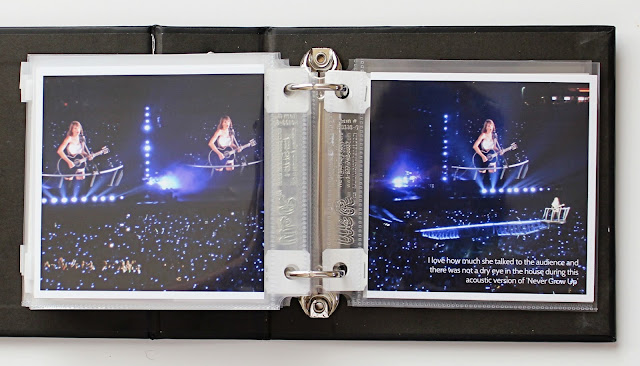
Here is the mini album that I made. I used minimal number of products, mainly a lot of Kelly Purkey Clearly Kelly stamps. Especially the New Adventures set which ended up being perfect for this album. I also used a set of transparencies from Seven Paper, some gold glitter stars, a little bit of washi tape and the 4x4 black album from Die Cuts with A View. It was a quick project and I can't stop looking at it and reliving the night. If you have a chance to see this show, do it. Don't think twice just do it and take your daughter, your niece or your friends daughter with you.


The day before the concert I made the Polaroid frame out of a piece of foam core, I also scanned the cover art into my Silhouette Cameo to cut out the T.S. 1989 so it matched the album cover. We did a little photo shoot to get ourselves in the mood and it totally did. It was so much fun and I took the frame with us to the concert so my friends daughters could also snap some pics with it too. I used one of the snaps to decorate the cover of the album. Some out takes also made it in as you will see below.


This is a little overview of the basic design of the album; photos and transparencies mixed in between. I stamped on vellum and made them tabs that I attached to the transparencies to help turn those pages. I grabbed a few images online to use in the album; the cover page, the collage of Polaroids, the set list, the stadium seating chart, the 1989 neon logo and I also took screen grabs of the two photos Taylor herself Instagramed from that nights show. All the other photos in the album were taken by me.


 The venue had very strict rules about what you could and could not carry into the stadium so I felt that needed to be documented.


These two pictures were pure luck. The fact that she was looking up over my head at one of the jumbo trons the minute Taylor took the stage was amazing. This is exactly what I thought would happen and I'm so glad I got it on film.


We screamed and danced our butts off!


On our way home I went thru the hashtag for the show and loved seeing my two pics that I posted in the feed so I took a screen shot to capture them. I used one of the screen shots in the album.


The lights were amazing.


We totally kept our wrist bands.


My shots of the special guests weren't that great but Taylor's Instagram pics were.


Concert mini albums FTW! I hope this inspires you to make something similar for one of your summer concerts. If you do, link me up in the comments I'd love to see it.

See you soon,
blog signature 012615

Tuesday, August 25, 2015

One Little Bird Hybrid Blog Guest

One of the raddest thing about sharing my work online is the opportunities that have come from that sharing. Case in point is a recent email that I received from Christine over at One Little Bird asking me if I was interested in being a Hybrid Blog Guest for Peppermint Granberg. Heck Yes! Is what I believe my response was. Peppermint is one of my favorite digital designers and I have lots and lots of her items in my Digital Scrapbooking library so I knew that finding something of hers to work with was going to be no problem. Coming up with what I felt was a worthy project that could stand up well enough to her teams work was the challenge.

While perusing her store over at The Lilypad I was mainly focused on the products I did not already own. I wanted items that were new to me so that whatever idea I came up with it would be fresh. I ultimately ended up choosing her recent line called Nosh. Mainly because I don't usually have any problems creating work that is centered around food. I mean...its a fact.


I ended up making a little dimensional pocket to create a sort of mini album of all of my favorite food photos from a recent trip to Portland that I took with my husband. I haven't had a chance to work with my photos from this trip yet so it was the perfect way to at least document what we ate since it was a trip very much about food and shopping.

I don't want to give away the whole project but wanted to at least share a few of the images from the blog post with you here. I made little postcards using one of the digital cards for each of the meals and drinks that we had on the trip and they slipped nicely into the dimensional pocket. I dressed up the inside with several items from the Nosh set.


Working hybrid style some of the elements were printed flat digitally but some of the elements were also printed and then cut for dimension like traditional scrapbooking.


Working on this project was an absolute blast and I am so thrilled that I was asked to do it. I would love it if you would pop over to Peppermint's blog right here to read and see the whole feature.

If you are interested in the supplies I used they are listed there but I will also list them here for you.


Thank you again to both Christine and Peppermint for asking me to contribute to the blog it was an awesome experience and I hope you all love the project as much as I do.

blog signature 012615

Friday, August 14, 2015

Going Digital with Kelly Purkey digital kits


I really love that Kelly Purkey decided to release her kits in digital form this past month. As you might know the Reading List kit sold out in record time which is awesome but because of that she offered up the Reading List Digital Kit. It includes the digital stamp and the printable cards. This really opened up even more options for using this kit which is so cool. I really hoped to made a mini album with the kit but I just didn't have the time but I did have an hour or so to sit down and make this digital layout that I can slip into my daughters school album.

I used the on my nightstand and the book digital stamps to create my background using the Pattern tool in Photoshop Elements. I then layered several of the Reading List cards on top of each other. I adjusted the opacity way down so they would be slightly see thru. I added the rating card digital stamp to each card and added in the text. I made sure to highlight some of my daughters favorite books from this time period and especially the book she is reading in the photo. I added in a few of the other digital stamps in the areas that were open and needing another little touch. I left one of the Reading List cards blank to add in my journaling and another was a mat for my photo.

You can see all of the digital offerings that Kelly Put up right here. She even put up some of the most popular recent stamp sets which is so awesome.

It was so much fun using the kit digitally that I hope I can continue to share something each month. I can't wait to see what's coming for August's release!
blog signature 012615

Wednesday, August 12, 2015

Featuring Color Cast Designs │ July releases

I wanted to make sure to share the two projects I made with Color Cast Designs July releases before the August product hits the shelves next week. The first project I made was a layout documenting a recent trip to Lake Tahoe. I was heavily influenced by the colors of the sand and the blue tones of the water and the sky so I got out my watercolors and just started laying down some paint to mimic the two distinct areas of the photo. Lake Tahoe is my daughters favorite place so I knew when we got there I wanted a photo so I could document her love of the lake. I used the white Right Now piece from the Currently set and mixed in some of the blue sea glass stars from the Twinkling Stars set because the color was just right. After the paint was dry I taped my photo right on top with a plain piece of masking tape.


I used the Peerless Watercolor Papers in Warm Sepia and Robin Eggs Blue for the background. The journaling was typed on vellum and adhered with my tiny attacher.


I love the sea glass accent against the blue.


My second project was a Project Life® spread for July 3rd and 4th. I loved the new items Jessica made for the fourth so I used the 4th of July set and the Stars, No Stripes set and I also added the 'this moment' circle is from the Currently Set to complete this half spread.  The flag card I used is from Studio Calico's July 2014 addon, the diagonal text card is from this years July 2015 addon. I sprinkled in some gold and silver glitter stars along with a blue star from Jessica's store. The gold glitter Lucky is from the Lucky Me set that is sold out.


I just loved the interchangeable circles and stars and had fun playing with different combos to dress up my cards.


Jessica has already shared some sneaks of what is coming for August you can check out her Instagram feed here for more of those.

Remember when you shop to use the code barbara (all lowercase) for 10% off your order.

blog signature 012615