When you've got it, you've got it and Kelly Purkey has it. Her designs have been gracing my work for years, from back in the days when she designed some Epic and Awesome stamps sets for Studio Calico to flash forward to today with her own brand of products. I get her and she seems to get me because everything she designs seems to just work for me. It also really helps that we have the same brain for catch phrases so that's a total plus. So much so that when she recently put out a call for her first ever design team I was very intrigued and applied. Needless to say I was absolutely thrilled when I got an email asking me to join the team. Which brings us to today. The release of the first batch of products I used as a member of her team. Her newest release of kits and stamps are so awesome, there really is something for everyone in this release. These sets can only be found on her website and when they sell out they are rarely restocked so you have to jump on the ones you love. You can see all of the new releases right here. I'd love to show you the three projects I have made so far this month.
The first that you can see a glimpse of above is a little mini album that I made with her Summertime kit. I took the opportunity to go back thru last summer's photos and pick out all of my favorites. It's super small and compact, just a lot of photos and some text and its a perfect little reminder of the fun that was had. Its totally putting me in the mood for summer to officially start.
This card above was the perfect cover, I used the new Bedford Alpha to stamp the year. And can I just say how much I love when alpha stamps come with coordinating numbers because I always need the numbers.
There were some really great cards that were perfect for adding in some journaling.
And what's not to love about fruit slices and heart eyes emoji's! The emoji stamp is from the Done and Done stamp set, LOVE!
Speaking of the Done and Done stamp set, it was perfect for a little catch up/my faves spread for my Project Life® album. The little icons were the perfect thing to highlight some of my favorites from this past month.
I also really loved working with the new 9" x 12" sized page protectors for this spread. These 3" x 3" squares are totally speaking to me.
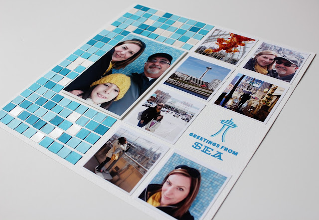
The last thing I made started out just as a 12 x 12 layout but I decided to turn it into a Project Life® spread at the last minute. Since I had already done the mini album for our trip this didn't need to be as detailed or full so it was the perfect way to capture it in my Project Life® by just focusing on the high points.
This side which was going to stand along as a layout was completely inspired by the tile wall we took this picture against. I cut the tiny 1/2" square pieces of paper from three shades of blue and one really pretty pearly metallic paper. I wanted some shimmer in there somewhere. It took some time to place each square down individually but I think the hardest part was placing them in a pleasingly random way. The Space Needle stamp in the PNW Is Best stamp set is the CUTEST thing ever! I stamped it in two colors to give it some depth. If you have been or are planning to go to Portland or Seattle anytime soon this stamp set is perfect for you.
Here's the left side of the spread where I got to use some of the other stamps from that set. I also used the Bedford alpha for the title card. I love the mountains and the coffee cup, I mean who doesn't love a good coffee cup stamp.
It's been a really great first month and I'm just so excited to work with Kelly. If you haven't already done so make sure you sign up for her newsletter you can find the spot to do that on the front page of her website here. She always announces her releases there so its really key to stay in the know with what's going on. Later this month I'll have even more stuff to share using some of Kelly's new Clearly Kelly releases so I look forward to that as well.
Take care,


You did amazing stuff with Kelly's products! And the blue tiles are absolutely genius. I may borrow that idea for some swim team pages. Do you mind sharing what font you've used for your journaling?
ReplyDeleteThank you so much! The design would totally work for swim team pages too. The journaling font I used is Avenir Next LT Pro and it is a free font.
DeleteThank you!
DeleteCongrats! Your projects look awesome as always!
ReplyDeleteYou are so sweet Jossie, thanks so much!
Delete