Photographing a mini album especially one as large as this can be a daunting task. Writing a blog post for it is just as daunting, which is why this post is a bit delayed. I finished this album in record time, just 15 days from the day we arrived home. The album I made last year took seven months and I swore this one wouldn't take that long. One of the things I did differently this year was start thinking about the design before I even got home. One afternoon while we were sitting around my mom's house on the last day's of the trip I started thinking about it and wrote down some notes and possible design ideas for the album. Here are those notes.
During our last road trip I realized there was certain data I wanted to keep track of so I made myself little post-its for each day. It was such a big help having the key bits of data right in the same spot. This data ended up being what I placed at the top of the Field Notes sheets that you will see.
Once I had all of those big design hurdles worked out I could get started choosing my photos and getting them laid out and printed. I apologize for the vast number of photos coming but I wanted to show the whole thing and not just snippets of it.
I was lucky enough to stop at a really great letterpress shop in Seattle and I found the perfect title card for the album.
Last year I made the info graphic for the last page of my album and I thought about doing the same but I was hesitant to repeat myself. I ended up laying out all of the data I had kept track of in a different way. It fit the clean look I was going for and I love the big impact all of the numbers have.
I decided to lay out the album in sections and labeled them for the over night stop we made. It did end up presenting a bit of a dilemma with the written text because that was done by day and not by stop. In some cases we did some sight seeing as we departed a stop so those photos are in the next section because I wanted to keep the photos with the text. It will make more sense below.
Klamath, California
Per my initial plan I wanted to add pockets in some fashion and decided to add them to the back of the divider. It allowed me to have a great place to stick the memorabilia I wasn't putting in the album but still wanted to save. It's not everything I brought home with me but the stuff that corresponds to the story I was telling. My philosophy is when in doubt grab it and save it, you can always edit this stuff down when you get home. I stamped along the edges of all of the pockets with stamps from Kelly Purkey. Here you can see the first of my Field Notes sheets. I ultimately decided to hand write the text in the top part of the form, not something I would normally do but typed text just looked weird to me. Doing just this little bit of hand writing actually inspired me to add more in the album, I think I just might have turned over a new leaf as far as hand journaling goes.
I decided in my planning to try printing the photos on matte photo paper and I really loved how they turned out. I typically love Glossy photo paper but the softness here is really nice. I was worried they wouldn't be as vibrant but that wasn't the case at all. Oh and check me out, being super bold and brave and adding in some hand written text. I drew light pencil lines in advance to keep me straight and even.
In some cases some of the memorabilia wouldn't fit in my pocket so if it didn't fit it got punched and added right to the album.
If you can't steal a room key, photograph it.
Newport, Oregon
This is an example of what I mentioned above, these photos are from Klamath but they took place the day we were driving to Newport. Because the text goes with Newport the photos ended up in that section in order to keep the photos with the text. Does that make sense? I hope so.
Astoria, Oregon
Seeing these Goonies sights was super, super cool. I just wished we had better weather for clearer photos.
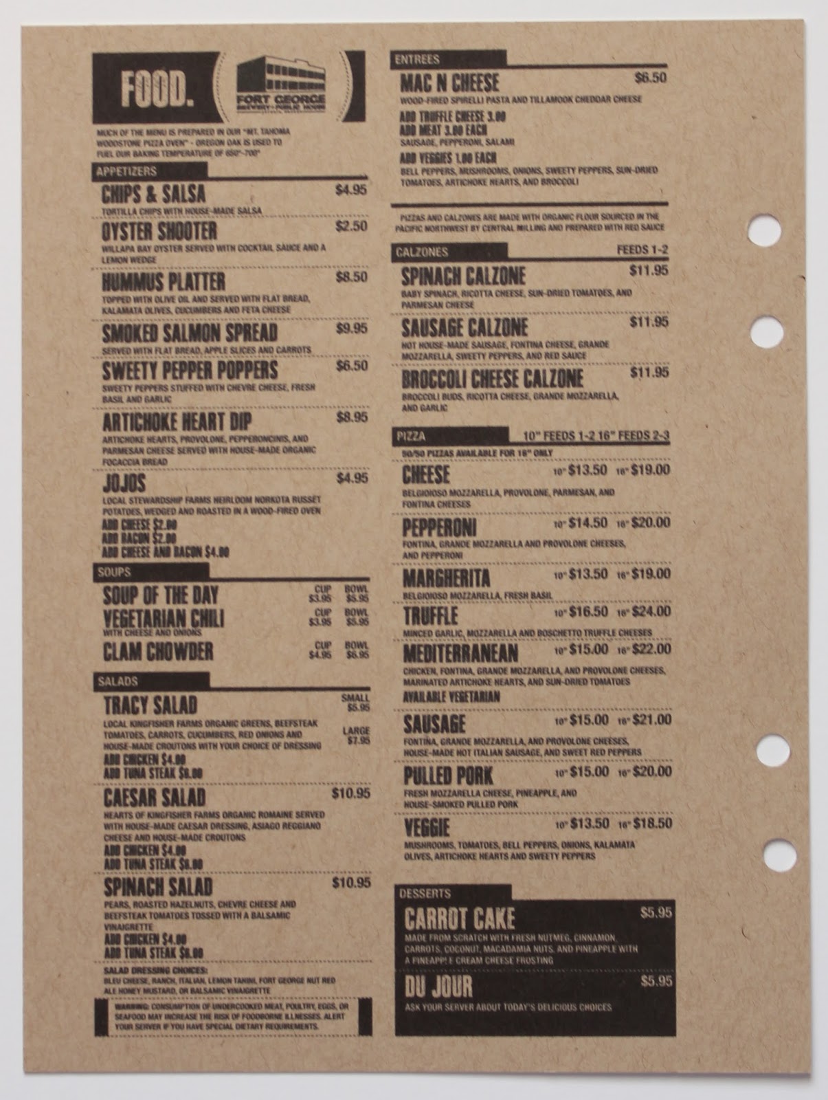
I had nothing left to fill this last page in the section so a quick Google search and I had the menu from our dinner to print out. I absolutely loved how all the black text in the album printed out on the Kraft paper.
Seattle, Washington
This pocket is bulging. I clearly had a hard time editing out the memorabilia but to be fair we spent three days in Seattle so there is bound to be more stuff.
I love this photo and the cool blue tile wall. The letterpress postcard on the right was from the same shop that I purchased the title card piece from. I bought two of these to have an extra.
We were very lucky with the most amazing weather in Seattle.
This exhibit was stunning, one of my favorite things that I saw Seattle.
This image on the left is a postcard, and I stapled this exhibit guide down so it would still open.
I love this photo my husband took of me and my daughter and another post card.
Restaurant coasters are a fun item to grab when you are traveling. The rating star stamp that I used here and above is from Kelly Purkey.
The EMP stickers are adhered to a plastic transparency and I had two, one on each side.
Centralia, Washington
Fall Creek, Oregon
Loved this stop to see the Columbia River Gorge so much, a must see if you are ever in that area.
The road home had just a few pictures since it was a long drive day.
A very simple end to the album signed and dated the day it was complete. The stamps I used are from Kelly Purkey.
I'll end this post with a photo and some words I posted to Instagram the day I finished this project.
I am a scrapbooker. I document my life with photos and
words. This is an album I just completed today of a recent family trip. It's
has 132 photos, 4,329 words, lots of bits of memorabilia, and barely any
embellishments. It took me 6 days to plan, organize, design, print and complete
and I agonized over every bit that I chose to write in my own hand. A true
labor of love that means so very much to me. When in doubt about the time and
energy a project like this can take remember that scrapbooking matters. Printing
photos matter. Taking the time to tell your story matters.


Love love your mini album! Thanks for a detailed share
ReplyDeleteThank you so much!
DeleteWonderful!!
ReplyDeleteThanks Gale!
DeleteI absolutely adore this album! After seeing bits and pieces on Instagram, I was hoping to see more. Thanks so much for taking the time to share. I am always so inspired by your work!
ReplyDeleteThank you so much! That means a lot to me. I'm so happy you popped over to see the whole thing.
DeleteSuch a great trip album! I'm sure you'll enjoy looking at it for years to come! Great memories!
ReplyDeleteThank you so much Dawn!
DeleteThis is just perfect. I love the Kraft combined with the photos. Looks perfect. And I also like the "Field Notes" you put together.
ReplyDeletewhich cut file did you use?
Thanks Andrea! I think I'll do a tutorial on the pockets, I've had a few questions on it so watch out for that very soon.
DeleteThanks for sharing your album and the process. I loved every little bit of it! So fun to see and I loved the style and approach and the final album looks so cool!!
ReplyDeletethis is a great combination of decorative and fun while getting the story told and down so it's not forgotten. You have used so many cool techniques here! I'm happy to discover your work through your joining Kelly's creative team, congratulations!
ReplyDelete