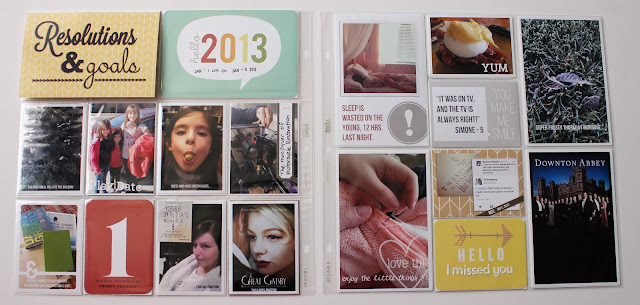
Let's get on with week 1
I loved the Studio Calico Project Life kit and really want to use as much of it as I can. Many of the inserts this week came from it.
One of the things I wanted to try was how to turn some of these 3x4 slots on Design F into a 6x4 if needed. I managed to figure it out for the resolutions card but plan on tweaking the design just a bit more. I'll post how to's for all my flip ups soon for sure.
I love having the Seafoam kit in its digital format. I love that I can change things as needed, including recoloring. For instance the card with the ! is actually a 3x4 journaling card that I enlarged to fit in the 4x6 slot.
Here is week 2
One thing I wanted to do more of this year is tell longer stories and write a bit more. I felt last years album could have used a lot more of that. Having two extra slots with this protector combo will hopefully allow for that. I was able to get quite a bit of text in one little 4x3 slot.
I think the thing I'm struggling with the most with this combo is that things are not in order. That's just how I'm wired. I want things to flow and go in chronological order. That being said I'm kind of digging the ability to highlight 4 photos a week in the larger 4x6 slots so I'm giving it a chance and will continue to evolve the process.
I hope your 2013 has started off well, thanks for stopping by.


I love your album so far. I am also doing sea foam this year. Can't wait to see how you will be using the digital elements. LOVE you style!!
ReplyDeleteYour pages are AWESOME!! Love, love, love them! =)
ReplyDeleteLove the digital pages - so nice looking!!
ReplyDeleteGreat layouts... and kudos for stepping out of your comfort zone and using different page protectors...
ReplyDelete