Showing posts with label Tutorial. Show all posts

Monday, February 8, 2016

Valentines Day │ 5 Things We Love About You

A notice came via email a week ago from my daughter's teacher asking all of the parents to write a love note to their child that would be read aloud this week at school. I of course thought this idea was amazing and sweet and totally right up my alley. She stated in the instructions that she was hoping for messages of accomplishment, encouragement of personal goals, memories and expressions of paternal love (x2 for us). That added up to five things in all so my wheels started turning on how I could accomplish this. I could have easily sat down with pen and paper and written it in letter form but she also said that we could feel free to get creative and add photos, artwork, stickers, etc. I need no extra incentive to make something more that it needs to be so when she said we could use photos I thought a little micro mini was the perfect idea.


My inspiration came from the numbered tags that Ali Edwards had included in her December Daily® kit this past year. I used one of them in my album as you can see here so I initially thought I would use the one thru five tags since I had only used the number fourteen.


I thought it would be really cute to add some red and pink foil to them using my Minc Machine and since I wasn't sure how these tags were printed I decided to make my own.

The first thing I had to do was create the tag shape. I used a tag I had already purchased as my starting point and then adjusted the size to what I wanted it to be. I knew I wanted to Minc the number and the little circle around the tag hole so I created my documents knowing I would use the Print and Cut feature. I have a laser printer so making custom items to Minc is super easy.


One thing you have to remember to do when creating items in your Silhouette studio is to make sure that if you are doing a print and cut is to turn off the cut lines for items you only want printed and not cut out. Here you can see that after the page is printed and I run it thru my Silhouette, the only thing that will be cut is the outside edge of the tag and the middle circle. The default setting is to always add a cut line to anything you create so if you don't remember to turn these cut lines off your Silhouette will cut everything out.


I knew that I wanted to cut my photos so they were the same size as the tags and lately I have had a lot of fun printing and cutting photos with my Silhouette. I copied my tag shape to a new document and then edited and cropped the photos to the correct size first in Photoshop Elements. I saved the photos as a .png files because I find when I save files as a .png it will import into my Silhouette studio in the exact size I want them to be. If I save them as a .jpg it will open quite large and then I would have to scale them down. I prefer to skip that step and import exactly as I need them to be. 


In order to make sure that the photos are lining up exactly in the right spot for the cut lines I make sure that the tag shape is brought to the front so that I can lay the photo underneath to line everything up. To to this just right click on the shape and select Bring to Front.


Here you can see the print and cut all ready to go and the cut lines are exactly where they need to be. I just run a letter size sheet of photo paper thru my printer and then cut it on my Silhouette. It works perfectly.


To finish off the project I created a little envelope to hold the tags that you can see below. I closed the envelope with twine that wraps around two circles that I attached with eyelets, one on the front and one on the back. I dressed up the front circle using a super cute emoji die set that is from Studio Calico. I cut most of it in gold foil cardstock and the heart eyes are cut from red foil.

I also made a simple cover tag to go on top of the others that I created in my Silhouette as well. It was made using the text tool and the XOXO is a digital element from In a Creative Bubble. The five is a gold thicker that I had in my stash.


My husband and I wrote our messages on the backs of the number tags so that you can read the messages and see the photos at the same time. Its super cute and since its a surprise my daughter has no idea its coming so I can't wait to hear all about it after she sees it.

xoxo,
blog signature 012615

Wednesday, April 22, 2015

PNW Mini Album │ the pocket tutorial


I've had a few questions on how I made the pockets for my PNW mini album so I thought I would do a quick tutorial for you. I used a shape from the Silhouette Store that you can see here and its on sale right so so that's a bonus!

I really liked the slanted edge of this pocket, I thought it would add some interest and it ended up being the perfect edge to add some stamping to. Now this file is intended to be cut fairly small and all in one piece. I knew that because of the size of my dividers 6" x 8.5" that I wasn't going to be able to cut them out of one piece of paper. I needed to modify the file a bit to get just the pocket.  Here is how I went about doing that. (Note: I am using Silhouette Studio v.3 for this tutorial)

The first thing to do is open the file in the Silhouette Studio program. Once the file is open we need to cut off the long edge of the cut file that is supposed to be the backside of the pocket. You will do this with the knife tool which is located along the left side menu.


You will click on the knife tool and hold down your mouse while you draw a line about a 1/2" from the edge, like this.


When you are done drawing the line release the mouse button and you will have separated the file into two pieces. Go ahead and click only the top portion and hit the delete key.


You are left with a much smaller version of that original cut file and just the pocket portion that we need.


Next we need to size the pocket so that it will be the correct size for our divider. The easiest way I have found to make sure something like this is the correct size is to create a shape so I can size it against. First I draw a rectangle and use the Scale Window to enter in the measurements I want my rectangle to be, in this case 6" x 8.5". That will adjust the rectangle I drew to the exact measurements I need.


Next you will need to adjust the pocket (which I have rotated here so its the correct orientation) by using the corner edit points only click and drag it until it is the correct size to fit on the rectangle.


Because the dashed lines are the fold lines I now know that this will cut the exact size I need to fit on top of my 6" x 8.5" dividers. I would now delete the rectangle I drew because we don't need it anymore and we definitely don't want it to be cut too.


I realized that I could get two out of one sheet of my letter sized Kraft paper by duplicating the file and rotating one on top of the other. I loved that I was able to save on paper that way.

When cut I made the decision to have the tallest point be to the left side (which you can see above) but before I made any folds I added the stamping so I was working on a flat surface. The stamps I used are from Kelly Purkey's Wanderlust stamp set (which is sold out but you can get the digital files here) and the little car came from her Get it Done Stamp Set. Once the stamping was done I folded the flaps back and I used strong adhesive to attach the pocket to the back side of my dividers. So far they have held up really well and the items stay in just great. Even the poor Seattle pocket is holding on just fine with all that stuff inside.

I hope this helps and if you have any questions please don't hesitate to ask.
blog signature 012615

Friday, November 7, 2014

Studio Calico Advent Calendar │a free download

Hello everyone, have you seen the super cute free Advent Calendar download that Studio Calico put up today? If not you can see it right here. I was sent the files a few days ago to make up one and I wanted to share a little bit of my process with you if you wanted to make something similar.


The first thing I did was take some time to think about what I wanted under each of the windows. Was it going to be a photo, some text or a mix of the two? This will not be the only Advent Calendar in our home this season so it didn't need to cover all of the bases, but take a more playful just for fun approach. As I made the list I noticed that it was turning into a sort of bucket list for the season. I added in all of the events I knew we were going to that had already been scheduled and then just added in more seasonal fun stuff to finish up the list.

Here is my list;
  1. Hello Twinkle! She's back! (our Elf on the Shelf)
  2. Watch a Christmas movie
  3. Make a Christmas playlist
  4. Make a Christmas craft
  5. Watch 'The Year without Santa' on TV
  6. Go Christmas Shopping
  7. Go see the Nutcracker
  8. Make a Gingerbread house
  9. Mail our Christmas Cards
  10. Happy 7th Birthday Simone!
  11. Have a fireside movie night
  12. Go see Christmas Lights
  13. Its Birthday Party Day!
  14. Go to the World of Christmas event
  15. Jingle some friends
  16. Pack up some old toys to donate
  17. Make Teacher Gifts
  18. Wrap presents
  19. Yay! Its the last day of school!
  20. Have a Starbucks date
  21. Watch 'The Little Drummer Boy' on TV
  22. Make Santa's cookies
  23. Clean my room!
  24. Go to church with the family, its Christmas Eve!
  25. Merry Christmas!
Just a tip, the ABC Family Channel provides their line up up Christmas specials online so I took a look at the list to make sure we caught the ones that aren't typically aired on network TV. So if you need that list you can see it right here.

I knew I didn't want to write out my items so I laid it all out using Photoshop Elements. I just went day by day and entered the text in the right space using the cut lines as my guide. I did have the main image open so I knew which box was which. The font I used for my text is Before Breakfast you can find it here


Once I had that laid out I had to work on the top. I ended up doing a print and cut and added in an offset on my Cameo so that it created a bit of the edge.  That was for two reasons a) to keep the pieces together, I didn't want the chimney smoke floating off by itself and b) because when I did the print and cut the registration marks would show on the page and I didn't want them on my finished piece. Here you can see what my document looked like in the Studio program.  I did have to freehand cut a few places at the very bottom of the document where it fell below the allowed cut area that the Cameo imposes when you do a print and cut but that can easily be fixed if you just shrink the piece down just a smidgen.


I did the same thing for the under layer with my text because I wanted it to match up exactly to the top layer when I placed it down on my page. In order to make sure it was all lined up correctly I used the same document above, just replaced the hand drawn house image with the one of my text so that I knew it would line up correctly when cut.


I made sure to delete the cut lines for the windows prior to printing because I didn't need to them cut. This is what I sent thru to my printer and then cut out. The only thing cut was the outer offset line.


Here you can see the finished piece with a few windows open, I did cut a bit too much away under one of the trees when I freehand cut those parts the Cameo didn't cut but its all good. All in all I was really happy with how everything lined up when the two layers were matched up.


I applied adhesive to the back of the top layer and had to make sure to go around some of the edges very carefully so they would stick down well when the windows were opened. I used Glossy Accents around those tight narrow areas and it worked great. The larger areas were glued just using my adhesive gun

I mounted both layers on top of a piece of red cardstock that I had first run thru my printer to add the title. I used the Voluptate free font found here for the word Christmas. This font doesn't provide capital letters so I just increased the size of just the letter C to make it appear as if it was capital. The font for the word countdown is CK Journaling found here. (note: please make sure you are careful when downloading fonts. Make sure you are aware of what you are clicking on and always have a virus protection program loaded on your computer before downloading anything. I cannot vouch for all download links, I just provide what I think is the best place possible so you can decided if you want to download it.)

I also added in a simple gold glitter enamel dot that came in a previous Studio Calico kit to dot the i, which just gives it a little something three dimensional.


I thought long and hard about coloring in the piece and I the first one I made was colored in with colored pencils and it looked super cute. I ultimately decided to go with a really graphic black and white feel but also wanted to color in a few bits and make it sparkle at the same time. I used the Gold Glitter Wink of Stella pen and went over a few spots, making sure to highlight a part of each of the numbers so they stood out. Its always hard to photograph anything with glitter but in the below image you can see a bit of how pretty and sparkly it looks in person.


I hope you have fun with the file, I can't wait to see what everyone does with it.

post signature

Wednesday, August 13, 2014

Custom Back to School Snack Bags


Hello Back to School! My daughter officially started last week so we are four days in to packing lunches and snacks and I'm already bored with writing her name on the snack bags.  Her lunch goes in her lunch box but for her morning recess she can take a small snack if she wants to and that is supposed to go in a small lunch bag labeled with her name. As I was writing her name on her bag again this morning I thought there has to be a better way to do this, definitely at least something a bit cuter and more fun.

I had played around with printing directly on lunch bags before for her soccer team so I thought why not do that again. I wanted to add some cute pictures and the Digital Stamps from the Teacher Card Kit addon from Studio Calico immediately came to mind.

I want to share how easy it is so you can start printing on your lunch bags too. I'm using Photoshop Elements 12 here but this could easily be done in a word processing program too.

1. First things first measure your lunch bags, I'm using the small regular sized brown Kraft lunch bags and they measure 5" wide by approximately 10 3/4" tall.

2. Lay out a document that is the same size as your bag so you know where to place your graphics and/or text and add in some guidelines.  My guidelines are placed at roughly 4" down from the top and 8" down from the top.


It is best to make sure that the printed text and image are placed above the fold line for the bottom of the bag by a good inch. I found on my specific printer if I get too close to that fold I get some excess smearing of the printer ink as its feeding through. I also printed my images on the same side as the bottom fold because there is a seam on the backside of my bags that got hung up when the printer was passing over the bag.

3. Once you have your document laid out pick out your digital elements and start laying it out. I really loved the glue bottle so that was the first one I played with. I decided on the size and placement and then added in my text.  The fonts I used for the bags shown in the image above are Orange Juice, Hello Kid Marker and AMPlayful which is a font I purchased for my Silhouette from the Silhouette store.


4. Because of the direction my printer prints and because I wanted to feed the solid edges of my bags into my printer first I had to flip my design before printing. I just grabbed both layers and with my move tool selected I rotated the image so that it was upside down and aligned with the bottom guideline.


5. Next I set up a custom print size for my printer (which is an Canon Pixma MG5320) so that it matched the size of my bag. I did this right from Photoshop Elements when I hit print I just selected Change Settings and Advanced Settings which brought up my Printer Properties Menu. I selected the Page Setup tab and then selected Custom from the page size drop down menu and entered in my measurements.


6. I placed the bag in the bag feed tray where I normally feed in my photo pager and hit print.  Here you can see better the side I printed on and the spacing above the fold.


I hope you give it a try, the possibilities truly are endless and here's a look at the bag I made for my daughters soccer team, I found the white lunch bags at Michael's and loved printing in color on the white background.


See you soon!
post signature

Sunday, June 29, 2014

Funnel Cake Digital files, how to video tutorial


I was asked by a few people to share a tutorial on how I made the California Insert on my Studio Calico Penny Arcade spread using the digital files of the Funnel Cake stamp addon. So I sat down and figured out how to a screen grab video tutorial for you all. I figured it would be much easier to explain if I showed it this way versus a step by step with photos.

Please forgive the newness of this for me, its always hard to capture what you want to say when a blinking red record button is staring you down so hopefully you can follow me and it makes sense.

This first video is showing how to work with the files using Photoshop Elements.  I'll show you exactly how I created the piece I made for my insert in this video.


This second video is showing you how to work with the files just using your Silhouette Studio program.  I'll show you how to trace and remove the states you might not want and how to create your own background layer for cutting.


If you have any questions, please don't hesitate to ask below in the comments or if you came over from Studio Calico you can leave any questions on the message board post too.

I did mention the two digital classes being offered over at Studio Calico in the first video. They are a great resource for expanding your knowledge of Digital Scrapbooking so if you would like more info on either of those you can find the Digital Basics class here or the Beyond Digital Basics class here.


post signature

Monday, May 12, 2014

How to make a Infographic using Photoshop Elements


When I was researching where to go and what to do on our recent Road Trip on Pinterest I kept seeing some really cool travel themed Infographics.  I pinned a few thinking how cool it would be to incorporate one into my road trip mini album when we returned.  When we returned from our trip my husband and I sat down to come up with a list of some things we could put on it.  I took some fairly detailed notes while we were on the trip but we still sat down to write our list the day after we got home.  It helped because the trip was fresh and we were able to write some stuff down that I didn't necessarily have in my trip notes that might have been forgotten when I finally had time to work on the album.

Fast forward a few months and I now had some time to work on the album.  My first big hurdle was figuring out how to make the Infographic.  I knew I could probably muddle my way thru using Photoshop Elements and I think I must have started at least 4 different times over the past few weeks.  Getting discouraged and frustrated each time and deleting everything and walking away from it saying to myself 'clearly you need to come up with another idea.'  But I just couldn't let it go, so I did Google search after Google search hoping to find some how to's that might help.  I did find a couple of really cool sites out there where you can build Infographics using their hosted platform but the templates weren't to my taste, or the graphics they had to use weren't what I wanted, or I found editing to be way too difficult for me to understand.  After a few failures in that direction I finally I said, 'you can do this' and went back to Photoshop Elements one last time determined to make it happen.

I decided for this last attempt I would break it down into manageable steps because I think my earlier attempts I was trying to do too much at once and it just wasn't working.  Below is a basic tutorial of how I went about making the above Infographic.  Hopefully this inspires you to make one and takes some of the guess work out of laying it all out.  Just so you know I'm using a PC and Photoshop Elements 12 for all the screen grabs you will see below.  I would say this falls on a scale of Moderate as far as difficulty goes.  It helps if you have a good understanding of working with layers, working with .png files, working with text and that you are comfortable moving items in and around your document.  I'm hoping that my tutorial is clear and helps guide you thru the steps in an efficient and easy to understand manner.

Let's get started.

1. Your first step is to come up with a list of items you would like to show on your Infographic.  This was my list of things;
  1. states we visited
  2. total miles traveled
  3. how many gas stops we made and how many gallons we bought
  4. how many other Simone's we met (that was kind of cool)
  5. elevations of the places we visited
  6. how many National Parks we went to
  7. how many baseball games we went to
  8. number of hotels we stayed in
  9. weather high and lows
  10. bug splats on the car
  11. how many different license plates we saw
  12. how many photos I took
  13. how many are we there yet's
I covered all but one of the items on my list, I eliminated the number of hotels we stayed in because I didn't find a graphic I liked enough to make it work.

I found it easiest to have all of the data tabulated, researched and written down. Especially for the items I didn't have written down in my notes like the elevations.  Starting and stopping to do research and calculations was making it cumbersome the first few times I tried this.

2. Next you need to create your document in Photoshop Elements.  The size I'm working with is specific to my mini album so I started with a blank document sized 6.25" x 8.25" with 300 dpi.


3. Then I started working down my list.  I decided that instead of worrying about the end result as I went that I would just work on each item and take it a little at a time laying each one out on my page.  Leaving the make it pretty work to the end. Here is what the document looked like after I worked on each piece.  I'll show details below but basically I would create each piece, link the separate layers together so they would stay together and move to the next item on my list.


Here is how I would go about working with the graphics and adding my text.

4. My first step was to find an icon to use if I didn't have one already.  In this case I needed a car for the miles driven.  I would just do a Google search for 'Car Icon' and search the images to find one that worked or that I liked.  A lot of time icons are already saved as .png files and will look like this, with a transparent background when its opened in Photoshop Elements.


That grey and white checked background means that there is no backing on the graphic, you can lay it on top of anything and the surrounding areas will be open.  As you can see in my sample above you can see my photo thru all of the open spaces and that is what a transparent backgound allows.

This image is the same icon but because the background of the image is white, when its laid on top of something else, like a photo the white square would be present as well.  Because of this all of that white space will need to be removed.


5.  To make an icon transparent you will need to select your Eraser Tool


6. then select the Magic Eraser tool in the tool menu


7. and then you will click on each white portion of the background until you have just the black remaining.


For this specific icon I had to touch these areas to clear all of the background.


Once you get the hang of this you will be deleting backgrounds on everything, I mean everything!  I love this technique because once its a transparent background you can recolor it so much easier and even clip paper or patterns to the item but that's a whole other topic.

8. Next I would worry about my text.  The font I used for all of my text on this piece was Gudea, I ended up making all of the text bold after I finished my piece because in some cases the thinner lines did not show up as well. It's completely up to you what you decided to do and really will be driven by the photo you are using as your base.  If it has a lot of white, a bolder line will be needed.

When I'm working with Photoshop Elements and making things on my own I typically make sure that each time I do something like create text or something, I like to make sure that each element is on their own layer. If you are not familiar with working with layers there are a ton of tutorials out there if needed. Keeping each element on its own layer just allows me to move things around freely and independently.  If I had typed my text on the same layer as the car icon, I would not be able to move the text independently of the car.  This will come in to play later when you are working with your final layout.


9. at this point I would link the two layers together move it out of my way and start on my next item.


I'm not going to show how I created each item because its basically exactly the same process.  Picking an icon if I had one I liked and adding the text.  As you can see in some cases I didn't use an icon and I think that's okay.  For those items I would just make the number large and it became my icon.  

10. My next step once I had all of the pieces they way I liked them I started moving them around on my background. Varying the layout as much as possible so it wasn't too much of a grid shape.  I wanted it to be as irregular as I could make it.  You can see it starting to shape up below. In some cases I increased the size of the items so it would take up more space and fill in all the gaps.  If you linked all of the parts together like I suggested above you can select the group, click on the move tool, pull from the corner and increase it to the desired size.  Because the pieces are linked they will increase proportionally.  Just make sure you don't pull from the middle or the piece will get distorted.  


Once I was happy with the basic layout I needed to start adding in my lines.  There are a few ways to make lines in Photoshop Elements.  The easiest being to just grab your line tool and start drawing them in.  I decided that I wanted to make dotted lines to separate my sections and that's a bit more work but not too difficult.

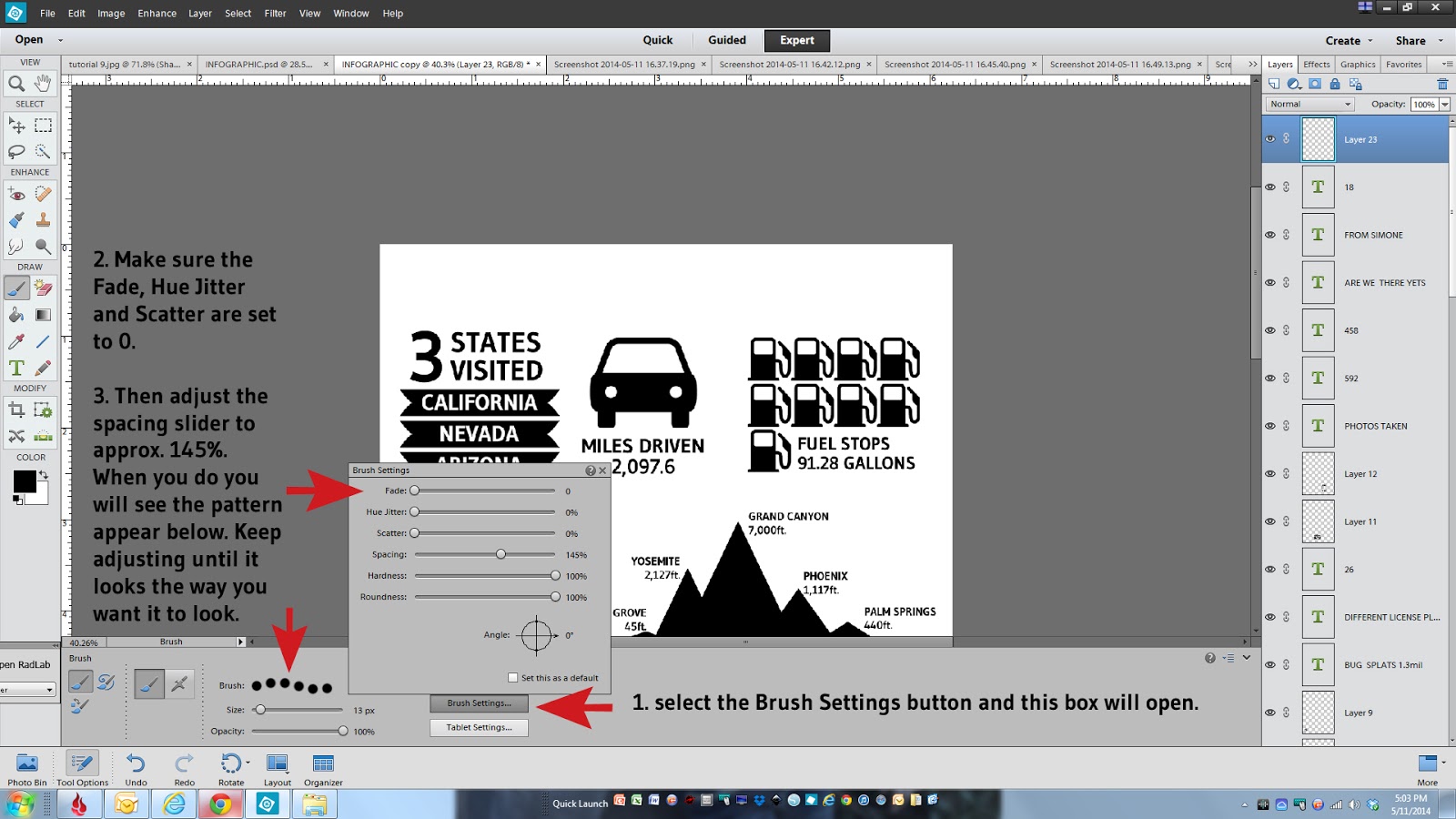
11.  The first step is start with a fresh layer at the top of your layers pallet, select the brush tool and then make sure that the plain brush is selected from the tool menu.


12. If its not defaulting to a small hard brush you'll want to make sure you have one selected, from the brush pull down menu choose a small hard brush.  For my dotted lines I picked a 13 px size brush.


13. The next steps will be where you define the spacing of your dotted line.  This involves a few more steps just to set up the parameters.  Select the brush settings button, make sure the top three items are set to 0, them adjust your spacing using the slider.  My spacing was set at 145%. Once you make that selection you will see a sample of the pattern appear.  Keep adjusting the spacing slider until it looks the way you want it to look.


14. Once the spacing is complete you need to draw the line. Unfortunately this part is hard to show via a screen grab but what you need to do is click with your mouse where you want the line to start, press and hold the shift key, move your mouse to where you want the line to end and click with your mouse.  Voila, you will have a dotted line!


15. The beauty of this is once you have your first line exactly where you want it, you can just duplicate that layer and move the lines in place.  You would just right click on the first layer you made, select duplicate layer, click on that duplicated layer and select the move tool and slide it in position.  I put all of my horizontal lines in place before adding in the vertical lines.


Because I new I wanted to have a photo under my Infographic and that I would want my photo to appear to have a white border along the edge I made sure my horizontal dotted lines stopped .25 inches away from the edge of my document.

16. Next you would just need to add in all of the vertical lines the same way you did the horizontal lines in steps 11-15 above.  Make one and then just duplicate and move it into place.  If you need to increase or decrease the length of your lines just click on the line so its highlighted and grab one of the selection points and the end of the line and drag it larger or smaller depending on what you need.


17. Next you would want to add a title to the top.


18. I would save the document at this point if you haven't already done so. Its always a good idea to save after each step just in case something happens along the way, believe me on that.  I would typically leave this document alone, with all of the layers separated in case I wanted to go back and make changes later. I never, ever merge my layers down in any document without saving a copy of that original layered version first.  You might find a typo or decide you want to remove something or make edits and its always nice to have your original layers left in tact.  Otherwise guess what, you will have to recreate the document or go thru a ton of editing maneuvers, and its a nightmare, trust me.

19. So that being said, working with a duplicate copy, you will then need to merge all of your layers down. The purpose of merging down all of your layers is so you have one seamless piece to work with.  To do that you would just grab the very top layer, press and hold the shift key, scroll down to the bottom layer (you don't need to grab the background) and click on it. Right click with your mouse and select merge layers.


Here you can see you now have one single layer instead of a whole bunch of separate ones.  You can also no longer edit anything independently....kind of scary.


And Hooray for your almost completed Infographic!

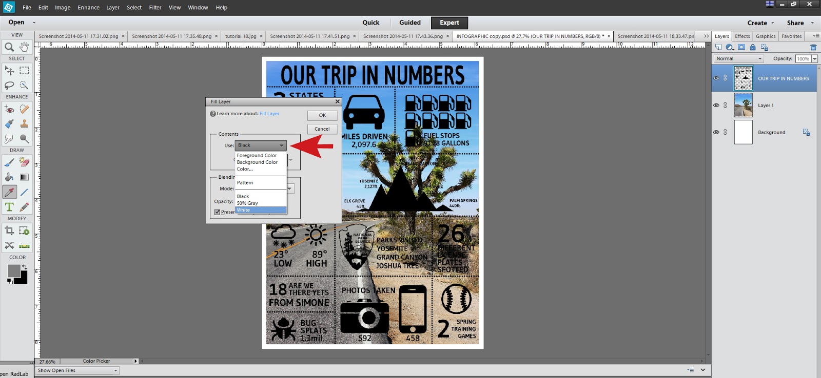
20. The next step is layering a photo underneath your graphic so pick one that you think will work nicely or help further tell your story.  You can also leave it plain and just color the background or leave it white, it's completely up to you.  I sized my photo to 6"x8" to fit right underneath leaving a white border around the edge.  You will want to make sure that your photo is on top of the background layer but below your graphic layer.


21. I personally liked the look of white text on top of the photo so to do that you just need to change the color of the graphic layer to white.  You can do this by making sure you have your graphic layer selected, then in the top menu choose Edit, Fill Layer.


Then in the pull down menu choose white, or color and then pick any color you would like and click okay.


As you can see here my top layer is now white and I think it stands out much better on this photo.  I did add a drop shadow to the graphic layer that I had purchased online but you could also add a custom drop shadow by selecting the layer with your graphic and from the top Layer menu, choose Layer Style, then Style Setting and select Drop Shadow.  You can customize the size, color and direction of the drop shadow from this menu.


At this point you are done!  Make sure you save it one more time so you can print it out and enjoy it. I do hope that this tutorial was informative and helps alleviate any apprehension you might have in trying one yourself.  It was a ton of fun and I'm so happy I was able to stick with it and make it work in a somewhat easy way.


If you have any questions, please don't hesitate to ask in the comments and I'll respond back as quickly as I can.

See you soon!

post signature