Monday, April 20, 2015

Pacific Northwest │ the mini album


Photographing a mini album especially one as large as this can be a daunting task. Writing a blog post for it is just as daunting, which is why this post is a bit delayed. I finished this album in record time, just 15 days from the day we arrived home. The album I made last year took seven months and I swore this one wouldn't take that long. One of the things I did differently this year was start thinking about the design before I even got home. One afternoon while we were sitting around my mom's house on the last day's of the trip I started thinking about it and wrote down some notes and possible design ideas for the album.  Here are those notes.


I actually think I did a pretty good job making my vision come to life. It certainly helped when I sat down to start working on it that I had a bit of a direction in my head. The first thing I did was make the dividers for each stop. I love how these turned out. I used a set of dividers I purchased from the Silhouette Store and modified the size to fit what I needed them to be. I added the text that I designed in Photoshop Elements and then print and cut them with my Cameo. The next step was to type up my hand written notes so I could edit them. I wasn't sure how I would use the text in this album but I had an idea to have it be the first thing in each section with the corresponding photos behind. I liked that idea because I wouldn't have to take a lot of time explaining the photos if the text was already there. In order to do that I had to come up with some sort of layout. I ended up making the field notes forms that you will see below and just copied my typed text in and hand wrote the data on the top.

During our last road trip I realized there was certain data I wanted to keep track of so I made myself little post-its for each day. It was such a big help having the key bits of data right in the same spot. This data ended up being what I placed at the top of the Field Notes sheets that you will see.


Once I had all of those big design hurdles worked out I could get started choosing my photos and getting them laid out and printed.  I apologize for the vast number of photos coming but I wanted to show the whole thing and not just snippets of it.

I was lucky enough to stop at a really great letterpress shop in Seattle and I found the perfect title card for the album.


Last year I made the info graphic for the last page of my album and I thought about doing the same but I was hesitant to repeat myself. I ended up laying out all of the data I had kept track of in a different way. It fit the clean look I was going for and I love the big impact all of the numbers have.


I decided to lay out the album in sections and labeled them for the over night stop we made. It did end up presenting a bit of a dilemma with the written text because that was done by day and not by stop. In some cases we did some sight seeing as we departed a stop so those photos are in the next section because I wanted to keep the photos with the text. It will make more sense below.

Klamath, California


Per my initial plan I wanted to add pockets in some fashion and decided to add them to the back of the divider. It allowed me to have a great place to stick the memorabilia I wasn't putting in the album but still wanted to save. It's not everything I brought home with me but the stuff that corresponds to the story I was telling. My philosophy is when in doubt grab it and save it, you can always edit this stuff down when you get home. I stamped along the edges of all of the pockets with stamps from Kelly Purkey. Here you can see the first of my Field Notes sheets. I ultimately decided to hand write the text in the top part of the form, not something I would normally do but typed text just looked weird to me. Doing just this little bit of hand writing actually inspired me to add more in the album, I think I just might have turned over a new leaf as far as hand journaling goes.


I decided in my planning to try printing the photos on matte photo paper and I really loved how they turned out. I typically love Glossy photo paper but the softness here is really nice. I was worried they wouldn't be as vibrant but that wasn't the case at all. Oh and check me out, being super bold and brave and adding in some hand written text. I drew light pencil lines in advance to keep me straight and even.


In some cases some of the memorabilia wouldn't fit in my pocket so if it didn't fit it got punched and added right to the album.


If you can't steal a room key, photograph it.


Newport, Oregon


This is an example of what I mentioned above, these photos are from Klamath but they took place the day we were driving to Newport. Because the text goes with Newport the photos ended up in that section in order to keep the photos with the text. Does that make sense? I hope so.


Astoria, Oregon


Seeing these Goonies sights was super, super cool. I just wished we had better weather for clearer photos.


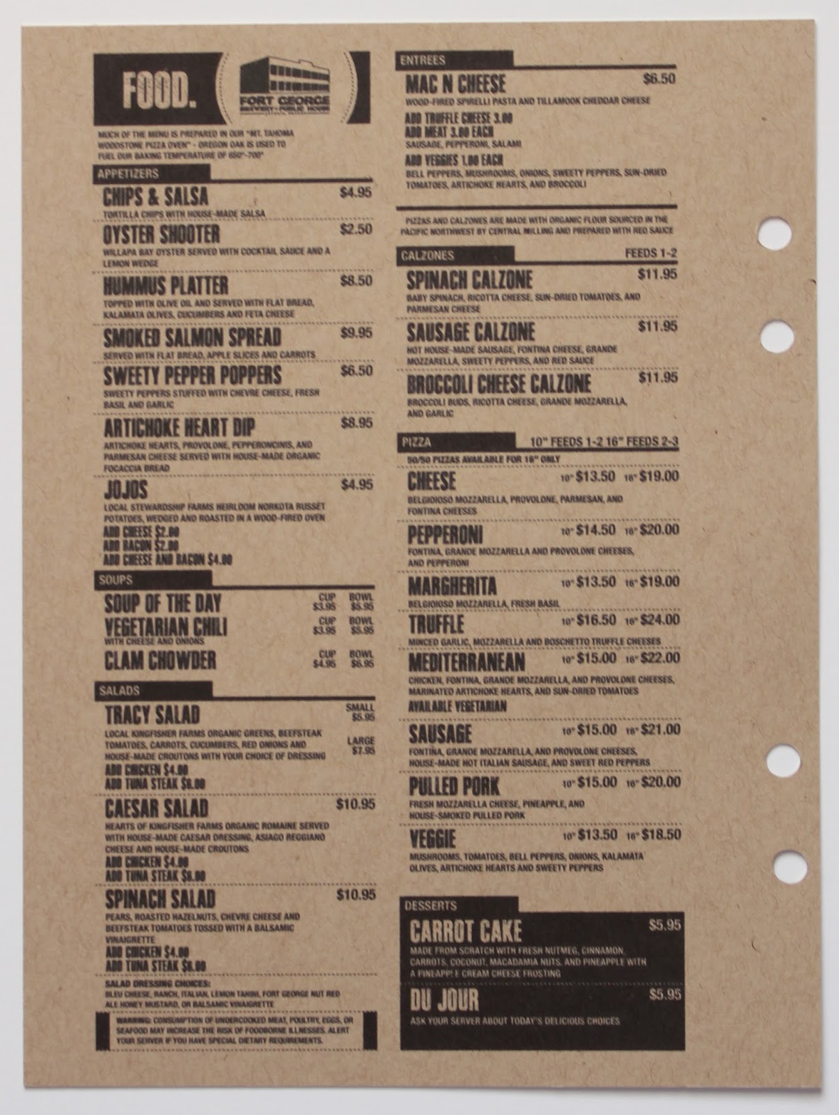
I had nothing left to fill this last page in the section so a quick Google search and I had the menu from our dinner to print out. I absolutely loved how all the black text in the album printed out on the Kraft paper.

Seattle, Washington


This pocket is bulging. I clearly had a hard time editing out the memorabilia but to be fair we spent three days in Seattle so there is bound to be more stuff.


I love this photo and the cool blue tile wall. The letterpress postcard on the right was from the same shop that I purchased the title card piece from. I bought two of these to have an extra.


We were very lucky with the most amazing weather in Seattle.


This exhibit was stunning, one of my favorite things that I saw Seattle.


This image on the left is a postcard, and I stapled this exhibit guide down so it would still open.


I love this photo my husband took of me and my daughter and another post card.


Restaurant coasters are a fun item to grab when you are traveling. The rating star stamp that I used here and above is from Kelly Purkey.


The EMP stickers are adhered to a plastic transparency and I had two, one on each side.


Centralia, Washington


Fall Creek, Oregon


Loved this stop to see the Columbia River Gorge so much, a must see if you are ever in that area.


The road home had just a few pictures since it was a long drive day.


A very simple end to the album signed and dated the day it was complete. The stamps I used are from Kelly Purkey.


I'll end this post with a photo and some words I posted to Instagram the day I finished this project.


I am a scrapbooker. I document my life with photos and words. This is an album I just completed today of a recent family trip. It's has 132 photos, 4,329 words, lots of bits of memorabilia, and barely any embellishments. It took me 6 days to plan, organize, design, print and complete and I agonized over every bit that I chose to write in my own hand. A true labor of love that means so very much to me. When in doubt about the time and energy a project like this can take remember that scrapbooking matters. Printing photos matter. Taking the time to tell your story matters.
blog signature 012615

Thursday, April 16, 2015

Color Cast Designs

Well hello! It's been awhile but I promise I have things to show for it! One of the major reasons for my long absence was another family road trip and if you can believe it I've already complete the album for it. I'll be sharing that soon but before I can get to all the stuff about me I have some exciting news to share.

While we were out of town I found out that I was chosen to be on the Design Team for Color Cast Designs. If you are not familiar with Jessica's work, you really need to check it out. She makes the most amazing scrapbooking embellishments from acrylic, wood and cork. Because I am such an embellishment lover I think its the perfect fit for me. I'm excited to work with her and the rest of the amazing team members for the next few months.

April is my first official month on the team and I complete three projects with some of her new items.

Here is a glimpse of the three projects I made for the launch. I will be showcasing them more on the Color Cast Designs Blog later this month but I wanted to at least show you what I've been up too.

project featuring new items from the Hashtag and Foodie sets

project featuring new items from the Adoption and Hashtag sets 

project featuring new items from the Foodie set

To see all of the new launches from Color Cast Designs this month, click here.


blog signature 012615

Wednesday, March 4, 2015

Workspace Wednesday │ the tooth fairy edition


We lost another tooth yesterday so it got me thinking about how I'm going to document all of this. I've done well taking the photos, making the cards and saving the receipts. I'm just not sure if I should make a separate mini album for this subject or if I should just add these in to her school album that I'm about to start. If you are documenting the tooth fairy and/or tooth loss how are you handling it? I'd love to know.

You can read all about the cards I made and the receipts in this post here.

blog signature 012615

Monday, March 2, 2015

Project Life® │ spreads three to six

The last part of February kind of kicked my butt, I got really sick after Valentine's Day and then it was my birthday and just like that its March. I hadn't intended to be gone for so long but at least I have a few spreads to catch you up on.

Spread 3 │This spread covers January nineteen to thirty and I'm really loving the 'no pressure to scrap every photo so I can fill a full spread every week approach'. Like a lot! My daughter is even appreciating the break in the photo taking. Lately she has come to me on her own and said 'hey do you want to take a picture of this'? I love that.


The Starbucks card was a screen shot from an email announcing I had a free drink, the veneer coffee cup is from Digital Design Essentials as is the flower and enamel dot on the title card. I used some digital files from Studio Calico on the photo of me and the other was from Kelly Purkey on our lunch date photo. Getting back to basics is pretty rad. As is that UR Perfect Card from Studio Calico. So hoard worthy but I'm trying to be better about that.


I changed up the protector on this side purely based on the photos I wanted to use, but it also left me the right amount of space for the next spread on the back side.


Spread 4 │ I opted to do one spread just for this day, it was worthy of its own focus. The page flag I used on the journaling card is from Kelly as is the stamp I added to the card.


Spread 5 │ February one to eight and my first weekly half spread and I loved it. Keeping it small and simple was a lot of fun. The gold February transparency came in a special pack from Studio Calico, I added the gold glitter letters to it. The rest of the cards and the hearts came from the Cirque Project Life kit from Studio Calico.


Spread 6 │ February nine thru the fifteenth, so of course is very pink and heart filled. I left the previous title slot open so it was see thru but did add another heart on the backside to cover the one on the front. I used a fair amount of digital stamps on the spread from Studio Calico and Digital Design Essentials. The rest were cards from the Cirque Project Life kit or collages I made myself.


I wanted to add in a real Plum Blossom bloom on the title card but I wasn't sure how it would stand up. I'm pressing some in a book right now to see what happens and may replace it in a few weeks if it works out. Until then I cut this print and cut from the Silhouette Store on vellum and added it to the title card.


In the middle of this spread are two large 8.5 x 11 photos from the week that I really wanted to showcase. I loved adding in these larger photos and I'm sure I will do it again. The digital files on this photo are older ones from Studio Calico.


A simple title and date on this one. I love that a phone photo can be printed this large and still look good.


I'm just about caught up and I only need to do one last spread for the remaining days of February that I hope to work on this week. My desk is still a mess so I might as well press on while it is.

See you soon,
blog signature 012615