Showing posts with label 2014 Road Trip Mini Album. Show all posts

Wednesday, October 15, 2014

Road Trip Mini Album - completed

Its only seven months late but I finally finished my Road Trip Mini Album from the big trip we took this past March. I have no idea why this project took me so long, well that might not be entirely true, I think the pressure of such a large task might have had something to do with it. But either way I'm so happy its done.

This will be photo heave so I apologize in advance, but here we go.... I'll try to call out supplies for the things I remember if you have specific questions, just let me know.

First up is the actual Album, I used an Aqua Studio Calico Handbook for this project, I just loved the color and I've used plenty of handbooks in the past so I knew it would hold all that I needed it to hold. I used a lot of Amy Tangerine's Plus One line throughout, both the physical and the digital versions. The globe sticker here is from that line, the white Alpha was from an old Studio Calico Project Life® kit.


Here is the finished album, it was a perfect fit.


The very first page of the album was done before I even left on the trip. I don't think I've ever shared it here but it was a total labor of love. I created the design in Photoshop Elements and printed it out in a very light grey right on my piece of cardstock and then I hand stitched the whole thing. I used a DMC variegated embroidery floss in color 4040 which was the perfect match for the album cover. As I recall it took me about 4 hours to complete but it was totally worth it.


After that I pretty much worked by location, grouping everything together so that it was easy to move from place to place. I needed a beginning so this was it, a very simple first page and then us heading out. I decided to keep my journaling to a minimum for the project because I was going to type up all of my trip notes and include them in the back. Because of that I decided to make up little 3x4 cards with the basic details of the day and our depart and arrival times if it was a travel day. I love how they look throughout the album and I used the digital day of the week art from Amy Tangerines Plus One collection. The 'And So the Adventure Begins' letterpress card is from Kelly Purkey. The supplies on the left page are all Amy Tangerine Plus One.


>> Yosemite

If you ever want to stay over near Yosemite, The Evergreen Lodge is amazing. This was our second time there and it won't be the last. Its picture perfect and just lovely. And I'm not getting any kick back for saying that!

I added in lots of small size items in the album, I just really like have things be different sizes, so here I just printed two 4x6 photos stuck them back to back and cut a few attachers from the Studio Calico mini attachers die and it was super easy.


I also loved using the small 4x4 We R Memory Keepers page protectors. I used them a few times and most often than not something was just stuck to the outside and left blank and clear surrounding it so you could see thru them.

On this trip we made a real effort to gather National Park Stamps when we passed thru a park, I bought a passport book for myself and a junior version of the passport book for my daughter and we had a great time collecting the stamps. I wasn't sure how I was going to use them but in the end I scanned the stamped images and deleted the background to create a transparent .png image that I could lay on top of my photos and recolor if needed. This is the first of a few you will see throughout the album.


I made my journaling card for the day the same shape as the sticker that was on the front so it wouldn't hang over the edge. I also scanned the little badge I purchased so get the size and then removed that portion from my photo grid so it would have a little place to sit on top of the photo.


I used a Studio Calico 6x8 handbook protector and just cut off the portion I didn't need since my photo grids were 6x6.


>> Las Vegas


I didn't love this stop, we got a super cheap room on Groupon at this hotel and it ended up being in the motor lodge which we knew in advance, I just wasn't expecting it to be quite so seedy. Thankfully it was just one night and it was clean and relatively safe. The girl had a blast in the arcade though, which made up for the not so good parts. Had to LOL at that 'rather forget this' sticker from Amy Tangerine, it was the perfect fit for this section.


We did stop for the Dam Tour....it was cool but the line was super long and it was super hot so it was kind of just okay. I opted to purchased the green screen photo which is the one on the left below. It was 6x8 so it was kind of a no brainer. The chipboard frames are from Crate and I used two back to back to hold some photos, I just stapled two of the attachers from Basic Grey to add it to my rings.


I grabbed as many brochures as was allowed on the trip and tried to add all of them in the album. I love this kind of stuff because it always changes over time and it will be cool to have and look at years from now.


>> The Grand Canyon


So this part was probably the longest section in the album and rightfully so. I used tons of large 6x8 photos and I really love them.


This is a large glassine envelope that I initially tried to print my journaling directly on but it wasn't having it so I ended up printing it on a piece of vellum and attaching it to the outside using a bit of vellum adhesive and my tiny attacher which I used to adhere the vellum arrows from Studio Calico's Atlantic release. I slipped in some info about our hotel and a few more photos from that first day.
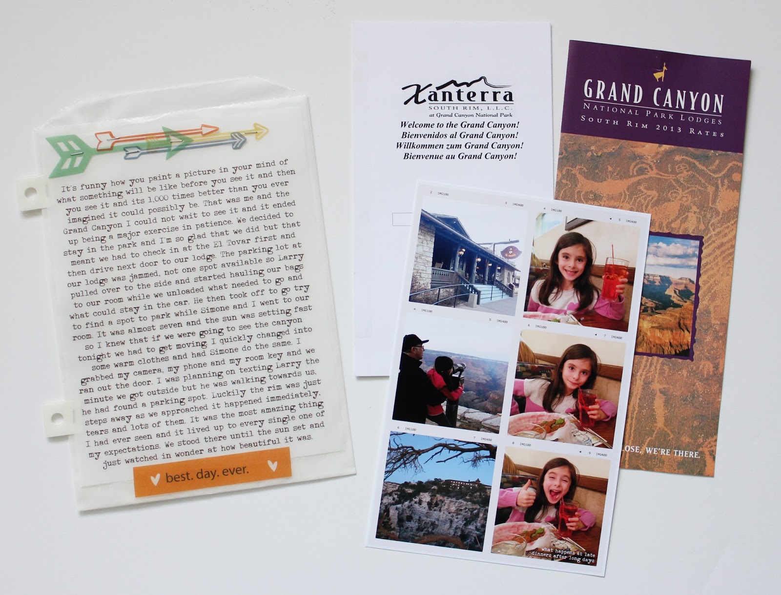

Here's another of the National Park Stamps on the left, for the most part I just wanted to leave all my photos plain and sometimes that's totally okay. The journaling card for this day needed some more space so I made it open like a book and also slipped a photo in behind it.


Man I would have paid money to see that sign in person, oh well. I wanted to call attention to the viewing areas we did stop at so I just printed up some simple vellum flags with the bus stop names and stapled it to one of my photos of the canyon, a quick and easy way to document that part of the tour.


Another brochure, you can't really tell here but I did take care to attached the plastic attachers in a way that allowed the maps to still open for anyone that wanted to see the whole thing.


This was one of my favorite photos of the day, my husband loves it too. He wasn't expecting me to take a picture but he was glad that I snapped it before I had my heart attack.


I wanted to talk a bit about my fears while we were at the Canyon but I didn't want to dwell on it so I decided to make a little vellum tag with a little text to make that point clear. I created the text and printed it out and cut it into two tag shapes and stitched them together, filled it with a random bit of sequins and sewed it all shut. Its one of my favorite things in the album.


I absconded every hotel room key that I could and I think I got them all but the key from Evergreen Lodge, theirs aren't steal-able, they are real keys that would have been missed. But the credit card ones are perfect to take home and use in your albums. Here I placed two back to back stuck to the outside of the protector. I also tried to take photos of our rooms whenever I could, I didn't use them all but its a fun reminder of what room you stayed in.  Oh and the quote on the bottom left photo was carved into the back of the El Tovar Hotel which was steps from where I took this photo.


>> Phoenix


I totally staged that top cactus photo but come on, we don't see them every day. The Yes No is a journaling card from Amy Tangerines Plus One line that I used digitally. I enlarged it to fit over my 5x7 photo.


We were lucky enough to see each of our home town teams play in Phoenix and seeing Spring Cactus League Games is something you should definitely put on your bucket list, it was a lot of fun. Super hot, but fun. The A's played their last season at that field so it was cool to be there for that.


Of course the tickets went in with our parking pass, I wish all sports events had this kind of price for parking. The Yay flair was from an old Studio Calico Project Life® kit and the stars and clips are from the Studio Calico Essentials line.


Made sure to take a screen grab of the results from that game because it was a high scoring game.


A very similar treatment for our day at the Giant's game.


Super Duper flair from a Studio Calico kit I believe.


another brochure


>> Joshua Tree
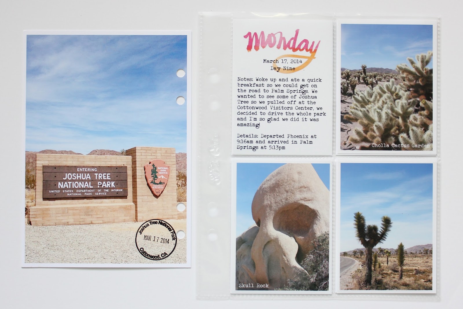

So this detour on our way to Palm Springs was a last minute decision that I'm so glad we took. We ended up taking the full loop tour thru the park and a kind ranger called out all the good spots we should stop at. It was so amazing! I purposely kept this section super plain because the photos were some of my favorite from the trip and I just loved how they turned out.


When browsing Pinterest for Road Trip ideas and places to stop I saw an image here that I loved it so much. I vowed that if we went to Joshua Tree I was going to find that tree and take my own photo and I found the tree and took my own photo. Its a slightly different angle but I was thrilled we found it. Thanks to my poor husband who had to slow to 5 mph any time we saw a tree right on the roadside until I could figure out if it was the right one or not. Apologies to any cars behind us that also had to slow to 5 mph.


Another sticker stuck to the outside of a small 4x4 protector.


 >> Palm Springs


Oh Ace Hotel, you were so, so cool! I cannot wait to go back one day, maybe even without the kidlet! Another room key cause it was super, super cool. The patch was won by Larry during the Bingo game, its just stapled in in case I ever want to remove it. Our photo by the ACE sign is perfect, I really wish I had the ladies name and address who took it for us, because she deserves my eternal gratitude for such a great shot.


Even the room map was cool. I need to remember to circle or note which one was ours, I forgot to do that.


Hitting up the Bingo Night was a gas, it totally made for the perfect last night.


>> The road home


I added in a few shots we took on our last morning at the Ace (the one of Simone on the bike was from the night before), but it was cute so I just slipped it in here. Our breakfast was super yummy but then it was time to hit the road. I had made Simone this map that outlined each travel days journey so she knew where we were headed and it really help to visually gave her an indication of how far we were going. This was a life saver as far as minimizing the 'are we there yet's' because she could follow along so she always knew how much further we had to go. She really kept a keen eye on the route home, I think she was eager to get back home to her own bed just as much as we were.

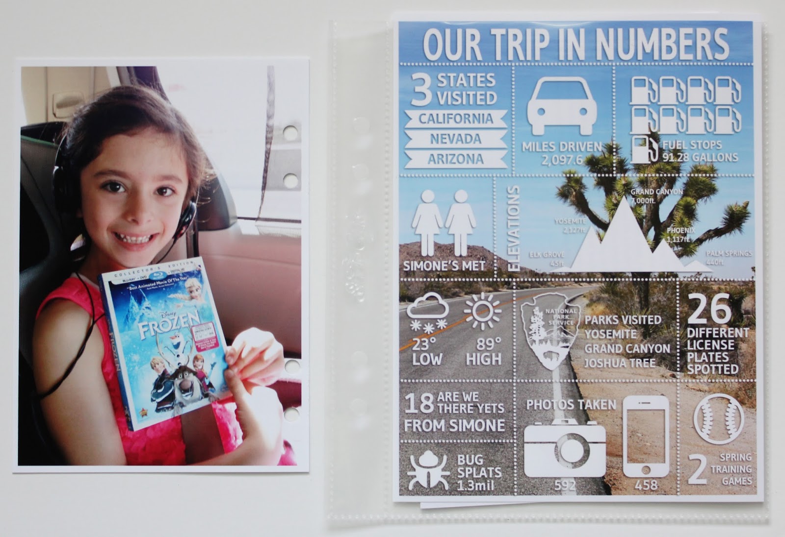

The last page is the Infographic I made, you can read the tutorial here. I also slipped in behind it my daily notes that I took on the trip that I typed up just so they were easier to read.


I'm so looking forward to another Road Trip adventure and hope we can put one together for next March too. At least now I know how to document it.


post signature

Monday, May 12, 2014

How to make a Infographic using Photoshop Elements


When I was researching where to go and what to do on our recent Road Trip on Pinterest I kept seeing some really cool travel themed Infographics.  I pinned a few thinking how cool it would be to incorporate one into my road trip mini album when we returned.  When we returned from our trip my husband and I sat down to come up with a list of some things we could put on it.  I took some fairly detailed notes while we were on the trip but we still sat down to write our list the day after we got home.  It helped because the trip was fresh and we were able to write some stuff down that I didn't necessarily have in my trip notes that might have been forgotten when I finally had time to work on the album.

Fast forward a few months and I now had some time to work on the album.  My first big hurdle was figuring out how to make the Infographic.  I knew I could probably muddle my way thru using Photoshop Elements and I think I must have started at least 4 different times over the past few weeks.  Getting discouraged and frustrated each time and deleting everything and walking away from it saying to myself 'clearly you need to come up with another idea.'  But I just couldn't let it go, so I did Google search after Google search hoping to find some how to's that might help.  I did find a couple of really cool sites out there where you can build Infographics using their hosted platform but the templates weren't to my taste, or the graphics they had to use weren't what I wanted, or I found editing to be way too difficult for me to understand.  After a few failures in that direction I finally I said, 'you can do this' and went back to Photoshop Elements one last time determined to make it happen.

I decided for this last attempt I would break it down into manageable steps because I think my earlier attempts I was trying to do too much at once and it just wasn't working.  Below is a basic tutorial of how I went about making the above Infographic.  Hopefully this inspires you to make one and takes some of the guess work out of laying it all out.  Just so you know I'm using a PC and Photoshop Elements 12 for all the screen grabs you will see below.  I would say this falls on a scale of Moderate as far as difficulty goes.  It helps if you have a good understanding of working with layers, working with .png files, working with text and that you are comfortable moving items in and around your document.  I'm hoping that my tutorial is clear and helps guide you thru the steps in an efficient and easy to understand manner.

Let's get started.

1. Your first step is to come up with a list of items you would like to show on your Infographic.  This was my list of things;
  1. states we visited
  2. total miles traveled
  3. how many gas stops we made and how many gallons we bought
  4. how many other Simone's we met (that was kind of cool)
  5. elevations of the places we visited
  6. how many National Parks we went to
  7. how many baseball games we went to
  8. number of hotels we stayed in
  9. weather high and lows
  10. bug splats on the car
  11. how many different license plates we saw
  12. how many photos I took
  13. how many are we there yet's
I covered all but one of the items on my list, I eliminated the number of hotels we stayed in because I didn't find a graphic I liked enough to make it work.

I found it easiest to have all of the data tabulated, researched and written down. Especially for the items I didn't have written down in my notes like the elevations.  Starting and stopping to do research and calculations was making it cumbersome the first few times I tried this.

2. Next you need to create your document in Photoshop Elements.  The size I'm working with is specific to my mini album so I started with a blank document sized 6.25" x 8.25" with 300 dpi.


3. Then I started working down my list.  I decided that instead of worrying about the end result as I went that I would just work on each item and take it a little at a time laying each one out on my page.  Leaving the make it pretty work to the end. Here is what the document looked like after I worked on each piece.  I'll show details below but basically I would create each piece, link the separate layers together so they would stay together and move to the next item on my list.


Here is how I would go about working with the graphics and adding my text.

4. My first step was to find an icon to use if I didn't have one already.  In this case I needed a car for the miles driven.  I would just do a Google search for 'Car Icon' and search the images to find one that worked or that I liked.  A lot of time icons are already saved as .png files and will look like this, with a transparent background when its opened in Photoshop Elements.


That grey and white checked background means that there is no backing on the graphic, you can lay it on top of anything and the surrounding areas will be open.  As you can see in my sample above you can see my photo thru all of the open spaces and that is what a transparent backgound allows.

This image is the same icon but because the background of the image is white, when its laid on top of something else, like a photo the white square would be present as well.  Because of this all of that white space will need to be removed.


5.  To make an icon transparent you will need to select your Eraser Tool


6. then select the Magic Eraser tool in the tool menu


7. and then you will click on each white portion of the background until you have just the black remaining.


For this specific icon I had to touch these areas to clear all of the background.


Once you get the hang of this you will be deleting backgrounds on everything, I mean everything!  I love this technique because once its a transparent background you can recolor it so much easier and even clip paper or patterns to the item but that's a whole other topic.

8. Next I would worry about my text.  The font I used for all of my text on this piece was Gudea, I ended up making all of the text bold after I finished my piece because in some cases the thinner lines did not show up as well. It's completely up to you what you decided to do and really will be driven by the photo you are using as your base.  If it has a lot of white, a bolder line will be needed.

When I'm working with Photoshop Elements and making things on my own I typically make sure that each time I do something like create text or something, I like to make sure that each element is on their own layer. If you are not familiar with working with layers there are a ton of tutorials out there if needed. Keeping each element on its own layer just allows me to move things around freely and independently.  If I had typed my text on the same layer as the car icon, I would not be able to move the text independently of the car.  This will come in to play later when you are working with your final layout.


9. at this point I would link the two layers together move it out of my way and start on my next item.


I'm not going to show how I created each item because its basically exactly the same process.  Picking an icon if I had one I liked and adding the text.  As you can see in some cases I didn't use an icon and I think that's okay.  For those items I would just make the number large and it became my icon.  

10. My next step once I had all of the pieces they way I liked them I started moving them around on my background. Varying the layout as much as possible so it wasn't too much of a grid shape.  I wanted it to be as irregular as I could make it.  You can see it starting to shape up below. In some cases I increased the size of the items so it would take up more space and fill in all the gaps.  If you linked all of the parts together like I suggested above you can select the group, click on the move tool, pull from the corner and increase it to the desired size.  Because the pieces are linked they will increase proportionally.  Just make sure you don't pull from the middle or the piece will get distorted.  


Once I was happy with the basic layout I needed to start adding in my lines.  There are a few ways to make lines in Photoshop Elements.  The easiest being to just grab your line tool and start drawing them in.  I decided that I wanted to make dotted lines to separate my sections and that's a bit more work but not too difficult.

11.  The first step is start with a fresh layer at the top of your layers pallet, select the brush tool and then make sure that the plain brush is selected from the tool menu.


12. If its not defaulting to a small hard brush you'll want to make sure you have one selected, from the brush pull down menu choose a small hard brush.  For my dotted lines I picked a 13 px size brush.


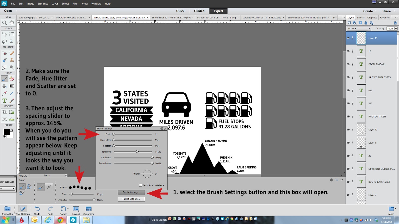
13. The next steps will be where you define the spacing of your dotted line.  This involves a few more steps just to set up the parameters.  Select the brush settings button, make sure the top three items are set to 0, them adjust your spacing using the slider.  My spacing was set at 145%. Once you make that selection you will see a sample of the pattern appear.  Keep adjusting the spacing slider until it looks the way you want it to look.


14. Once the spacing is complete you need to draw the line. Unfortunately this part is hard to show via a screen grab but what you need to do is click with your mouse where you want the line to start, press and hold the shift key, move your mouse to where you want the line to end and click with your mouse.  Voila, you will have a dotted line!


15. The beauty of this is once you have your first line exactly where you want it, you can just duplicate that layer and move the lines in place.  You would just right click on the first layer you made, select duplicate layer, click on that duplicated layer and select the move tool and slide it in position.  I put all of my horizontal lines in place before adding in the vertical lines.


Because I new I wanted to have a photo under my Infographic and that I would want my photo to appear to have a white border along the edge I made sure my horizontal dotted lines stopped .25 inches away from the edge of my document.

16. Next you would just need to add in all of the vertical lines the same way you did the horizontal lines in steps 11-15 above.  Make one and then just duplicate and move it into place.  If you need to increase or decrease the length of your lines just click on the line so its highlighted and grab one of the selection points and the end of the line and drag it larger or smaller depending on what you need.


17. Next you would want to add a title to the top.


18. I would save the document at this point if you haven't already done so. Its always a good idea to save after each step just in case something happens along the way, believe me on that.  I would typically leave this document alone, with all of the layers separated in case I wanted to go back and make changes later. I never, ever merge my layers down in any document without saving a copy of that original layered version first.  You might find a typo or decide you want to remove something or make edits and its always nice to have your original layers left in tact.  Otherwise guess what, you will have to recreate the document or go thru a ton of editing maneuvers, and its a nightmare, trust me.

19. So that being said, working with a duplicate copy, you will then need to merge all of your layers down. The purpose of merging down all of your layers is so you have one seamless piece to work with.  To do that you would just grab the very top layer, press and hold the shift key, scroll down to the bottom layer (you don't need to grab the background) and click on it. Right click with your mouse and select merge layers.


Here you can see you now have one single layer instead of a whole bunch of separate ones.  You can also no longer edit anything independently....kind of scary.


And Hooray for your almost completed Infographic!

20. The next step is layering a photo underneath your graphic so pick one that you think will work nicely or help further tell your story.  You can also leave it plain and just color the background or leave it white, it's completely up to you.  I sized my photo to 6"x8" to fit right underneath leaving a white border around the edge.  You will want to make sure that your photo is on top of the background layer but below your graphic layer.


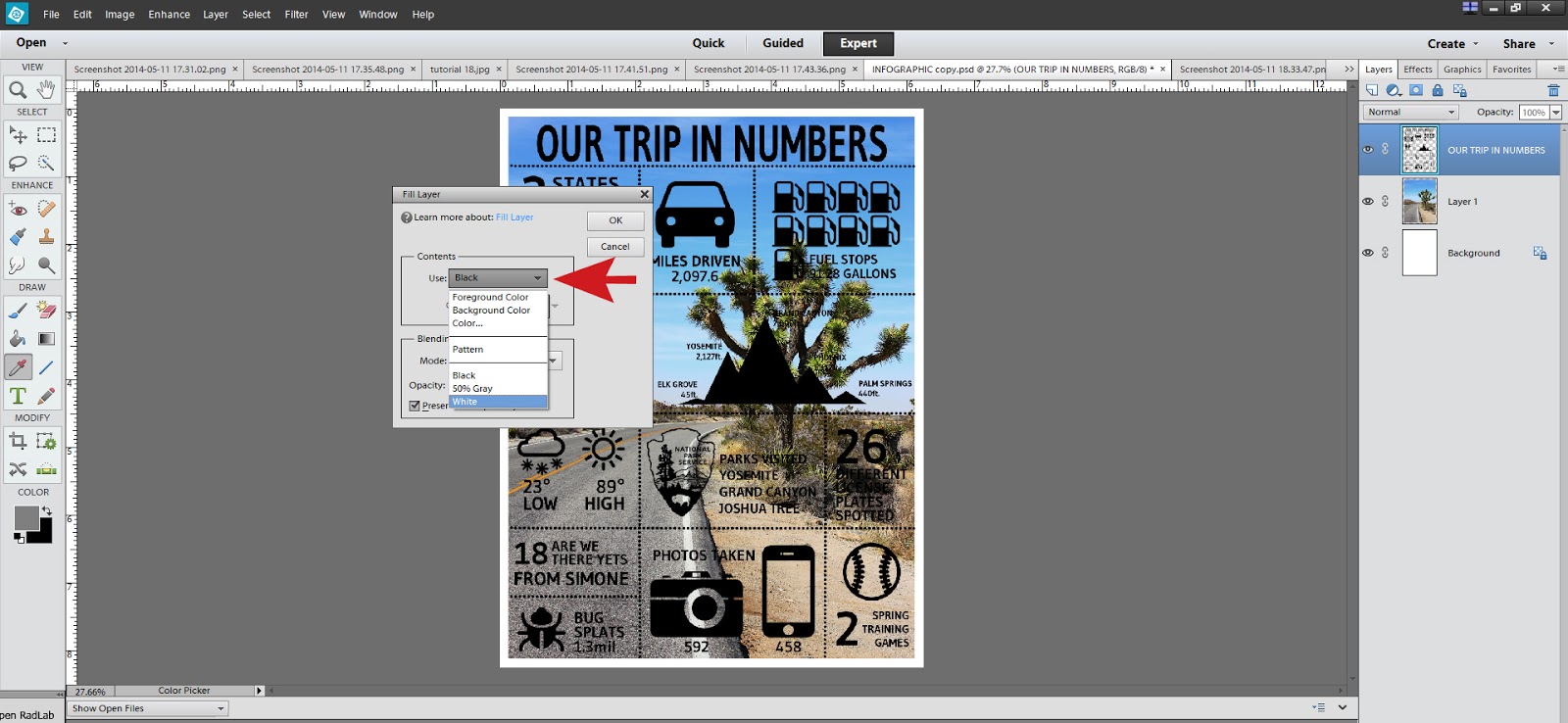
21. I personally liked the look of white text on top of the photo so to do that you just need to change the color of the graphic layer to white.  You can do this by making sure you have your graphic layer selected, then in the top menu choose Edit, Fill Layer.


Then in the pull down menu choose white, or color and then pick any color you would like and click okay.


As you can see here my top layer is now white and I think it stands out much better on this photo.  I did add a drop shadow to the graphic layer that I had purchased online but you could also add a custom drop shadow by selecting the layer with your graphic and from the top Layer menu, choose Layer Style, then Style Setting and select Drop Shadow.  You can customize the size, color and direction of the drop shadow from this menu.


At this point you are done!  Make sure you save it one more time so you can print it out and enjoy it. I do hope that this tutorial was informative and helps alleviate any apprehension you might have in trying one yourself.  It was a ton of fun and I'm so happy I was able to stick with it and make it work in a somewhat easy way.


If you have any questions, please don't hesitate to ask in the comments and I'll respond back as quickly as I can.

See you soon!

post signature